 Полная версия
The Elements of Drawing, in Three Letters to Beginners
9
It is more difficult, at first, to get, in color, a narrow gradation than an extended one; but the ultimate difficulty is, as with the pen, to make the gradation go far.
10
Of course, all the columns of color are to be of equal length.
11
The degree of darkness you can reach with the given color is always indicated by the color of the solid cake in the box.
12
The figure a, Fig. 5, is very dark, but this is to give an example of all kinds of depths of tint, without repeated figures.
13
Nearly neutral in ordinary circumstances, but yet with quite different tones in its neutrality, according to the colors of the various reflected rays that compose it.
14
If we had any business with the reasons of this, I might perhaps be able to show you some metaphysical ones for the enjoyment, by truly artistical minds, of the changes wrought by light and shade and perspective in patterned surfaces; but this is at present not to the point; and all that you need to know is that the drawing of such things is good exercise, and moreover a kind of exercise which Titian, Veronese, Tintoret, Giorgione, and Turner, all enjoyed, and strove to excel in.
15
The use of acquiring this habit of execution is that you may be able, when you begin to color, to let one hue be seen in minute portions, gleaming between the touches of another.
16
William Hunt, of the Old Water-color Society.
17
At Marlborough House, [in 1857] among the four principal examples of Turner's later water-color drawing, perhaps the most neglected was that of fishing-boats and fish at sunset. It is one of his most wonderful works, though unfinished. If you examine the larger white fishing-boat sail, you will find it has a little spark of pure white in its right-hand upper corner, about as large as a minute pin's head, and that all the surface of the sail is gradated to that focus. Try to copy this sail once or twice, and you will begin to understand Turner's work. Similarly, the wing of the Cupid in Correggio's large picture in the National Gallery is focused to two little grains of white at the top of it. The points of light on the white flower in the wreath round the head of the dancing child-faun, in Titian's Bacchus and Ariadne, exemplify the same thing.
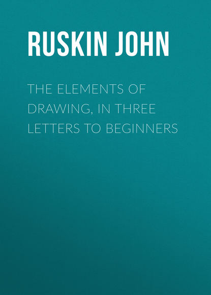
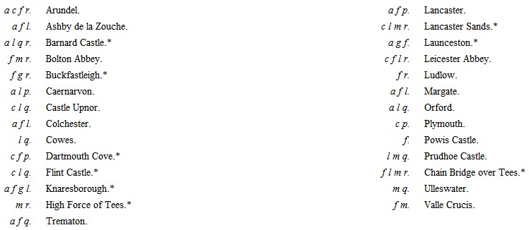
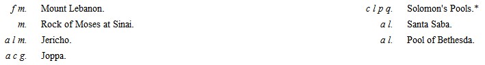
18
I shall not henceforward number the exercises recommended; as they are distinguished only by increasing difficulty of subject, not by difference of method.
19
If you understand the principle of the stereoscope you will know why; if not, it does not matter; trust me for the truth of the statement, as I cannot explain the principle without diagrams and much loss of time. See, however, Note 1, in Appendix I.
20
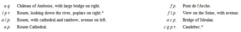
The plates marked with a star are peculiarly desirable. See note at the end of Appendix I. The letters mean as follows:—
a stands for architecture, including distant grouping of towns, cottages, etc.
c clouds, including mist and aërial effects.
f foliage.
g ground, including low hills, when not rocky.
l effects of light.
m mountains, or bold rocky ground.
p power of general arrangement and effect.
q quiet water.
r running or rough water; or rivers, even if calm, when their line of flow is beautifully marked.
From the England Series.
From the Keepsake.

From the Bible Series.
From Scott's Works.
From the Rivers of France.
21
As well;—not as minutely: the diamond cuts finer lines on the steel than you can draw on paper with your pen; but you must be able to get tones as even, and touches as firm.
22
See, for account of these plates, the Appendix on "Works to be studied."
23
See Note 2 in Appendix I.
24
This sketch is not of a tree standing on its head, though it looks like it. You will find it explained presently.
25
It is meant, I believe, for "Salt Hill."
26
I do not mean that you can approach Turner or Dürer in their strength, that is to say, in their imagination or power of design. But you may approach them, by perseverance, in truth of manner.
27
The following are the most desirable plates:—
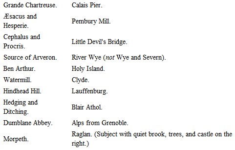
If you cannot get one of these, any of the others will be serviceable, except only the twelve following, which are quite useless:—
1. Scene in Italy, with goats on a walled road, and trees above.
2. Interior of church.
3. Scene with bridge, and trees above; figures on left, one playing a pipe.
4. Scene with figure playing on tambourine.
5. Scene on Thames with high trees, and a square tower of a church seen through them.
6. Fifth Plague of Egypt.
7. Tenth Plague of Egypt.
8. Rivaulx Abbey.
9. Wye and Severn.
10. Scene with castle in center, cows under trees on the left.
11. Martello Towers.
12. Calm.
It is very unlikely that you should meet with one of the original etchings; if you should, it will be a drawing-master in itself alone, for it is not only equivalent to a pen-and-ink drawing by Turner, but to a very careful one; only observe, the Source of Arveron, Raglan, and Dumblane were not etched by Turner; and the etchings of those three are not good for separate study, though it is deeply interesting to see how Turner, apparently provoked at the failure of the beginnings in the Arveron and Raglan, took the plates up himself, and either conquered or brought into use the bad etching by his marvelous engraving. The Dumblane was, however, well etched by Mr. Lupton, and beautifully engraved by him. The finest Turner etching is of an aqueduct with a stork standing in a mountain stream, not in the published series; and next to it, are the unpublished etchings of the Via Mala and Crowhurst. Turner seems to have been so fond of these plates that he kept retouching and finishing them, and never made up his mind to let them go. The Via Mala is certainly, in the state in which Turner left it, the finest of the whole series: its etching is, as I said, the best after that of the aqueduct. Figure 20, above, is part of another fine unpublished etching, "Windsor, from Salt Hill." Of the published etchings, the finest are the Ben Arthur, Æsacus, Cephalus, and Stone Pines, with the Girl washing at a Cistern; the three latter are the more generally instructive. Hindhead Hill, Isis, Jason, and Morpeth, are also very desirable.
28
You will find more notice of this point in the account of Harding's tree-drawing, a little farther on.
29
The impressions vary so much in color that no brown can be specified.
30
You had better get such a photograph, even though you have a Liber print as well.
31
See the closing letter in this volume.
32
[In 1857.]
33
If you are not acquainted with Harding's works, (an unlikely supposition, considering their popularity,) and cannot meet with the one in question, the diagrams given here will enable you to understand all that is needful for our purposes.
34
I draw this figure (a young shoot of oak) in outline only, it being impossible to express the refinements of shade in distant foliage in a wood-cut.
35
His lithographic sketches, those for instance in the Park and the Forest, and his various lessons on foliage, possess greater merit than the more ambitious engravings in his Principles and Practice of Art. There are many useful remarks, however, dispersed through this latter work.
36
On this law you do well, if you can get access to it, to look at the fourth chapter of the fourth volume of Modern Painters.
37
See Note 3 in Appendix I.
38
The student may hardly at first believe that the perspective of buildings is of little consequence; but he will find it so ultimately. See the remarks on this point in the Preface.
39
See Note 4 in Appendix I.
40
See Note 5 in Appendix I.
41
It is a useful piece of study to dissolve some Prussian blue in water, so as to make the liquid definitely blue: fill a large white basin with the solution, and put anything you like to float on it, or lie in it; walnut shells, bits of wood, leaves of flowers, etc. Then study the effects of the reflections, and of the stems of the flowers or submerged portions of the floating objects, as they appear through the blue liquid; noting especially how, as you lower your head and look along the surface, you see the reflections clearly; and how, as you raise your head, you lose the reflections, and see the submerged stems clearly.
42
Respecting Architectural Drawing, see the notice of the works of Prout in the Appendix.
43
I give Rossetti this pre-eminence, because, though the leading Pre-Raphaelites have all about equal power over color in the abstract, Rossetti and Holman Hunt are distinguished above the rest for rendering color under effects of light; and of these two, Rossetti composes with richer fancy, and with a deeper sense of beauty, Hunt's stern realism leading him continually into harshness. Rossetti's carelessness, to do him justice, is only in water-color, never in oil.
44
All the degradation of art which was brought about, after the rise of the Dutch school, by asphaltum, yellow varnish, and brown trees would have been prevented, if only painters had been forced to work in dead color. Any color will do for some people, if it is browned and shining; but fallacy in dead color is detected on the instant. I even believe that whenever a painter begins to wish that he could touch any portion of his work with gum, he is going wrong.
It is necessary, however, in this matter, carefully to distinguish between translucency and luster. Translucency, though, as I have said above, a dangerous temptation, is, in its place, beautiful; but luster or shininess is always, in painting, a defect. Nay, one of my best painter-friends (the "best" being understood to attach to both divisions of that awkward compound word,) tried the other day to persuade me that luster was an ignobleness in anything; and it was only the fear of treason to ladies' eyes, and to mountain streams, and to morning dew, which kept me from yielding the point to him. One is apt always to generalize too quickly in such matters; but there can be no question that luster is destructive of loveliness in color, as it is of intelligibility in form. Whatever may be the pride of a young beauty in the knowledge that her eyes shine (though perhaps even eyes are most beautiful in dimness), she would be sorry if her cheeks did; and which of us would wish to polish a rose?
45
But not shiny or greasy. Bristol board, or hot-pressed imperial, or gray paper that feels slightly adhesive to the hand, is best. Coarse, gritty, and sandy papers are fit only for blotters and blunderers; no good draughtsman would lay a line on them. Turner worked much on a thin tough paper, dead in surface; rolling up his sketches in tight bundles that would go deep into his pockets.
46
I insist upon this unalterability of color the more because I address you as a beginner, or an amateur: a great artist can sometimes get out of a difficulty with credit, or repent without confession. Yet even Titian's alterations usually show as stains on his work.
47
It is, I think, a piece of affectation to try to work with few colors: it saves time to have enough tints prepared without mixing, and you may at once allow yourself these twenty-four. If you arrange them in your color-box in the order I have set them down, you will always easily put your finger on the one you want.
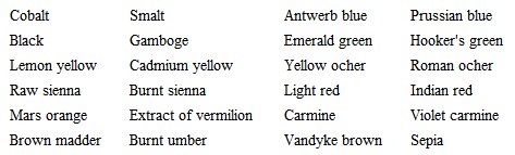
Antwerp blue and Prussian blue are not very permanent colors, but you need not care much about permanence in your work as yet, and they are both beautiful; while Indigo is marked by Field as more fugitive still, and is very ugly. Hooker's green is a mixed color, put in the box merely to save you loss of time in mixing gamboge and Prussian blue. No. 1 is the best tint of it. Violet carmine is a noble color for laying broken shadows with, to be worked into afterwards with other colors.
If you wish to take up coloring seriously you had better get Field's "Chromatography" at once; only do not attend to anything it says about principles or harmonies of color; but only to its statements of practical serviceableness in pigments, and of their operations on each other when mixed, etc.
48
A more methodical, though under general circumstances uselessly prolix way, is to cut a square hole, some half an inch wide, in the sheet of cardboard, and a series of small circular holes in a slip of cardboard an inch wide. Pass the slip over the square opening, and match each color beside one of the circular openings. You will thus have no occasion to wash any of the colors away. But the first rough method is generally all you want, as, after a little practice, you only need to look at the hue through the opening in order to be able to transfer it to your drawing at once.
49
If colors were twenty times as costly as they are, we should have many more good painters. If I were Chancellor of the Exchequer I would lay a tax of twenty shillings a cake on all colors except black, Prussian blue, Vandyke brown, and Chinese white, which I would leave for students. I don't say this jestingly; I believe such a tax would do more to advance real art than a great many schools of design.
50
I say modern, because Titian's quiet way of blending colors, which is the perfectly right one, is not understood now by any artist. The best color we reach is got by stippling; but this is not quite right.
51
See Note 6 in Appendix I.
52
The worst general character that color can possibly have is a prevalent tendency to a dirty yellowish green, like that of a decaying heap of vegetables; this color is accurately indicative of decline or paralysis in missal-painting.
53
That is to say, local color inherent in the object. The gradations of color in the various shadows belonging to various lights exhibit form, and therefore no one but a colorist can ever draw forms perfectly (see Modern Painters, vol. iv. chap. iii. at the end); but all notions of explaining form by superimposed color, as in architectural moldings, are absurd. Color adorns form, but does not interpret it. An apple is prettier because it is striped, but it does not look a bit rounder; and a cheek is prettier because it is flushed, but you would see the form of the cheek bone better if it were not. Color may, indeed, detach one shape from another, as in grounding a bas-relief, but it always diminishes the appearance of projection, and whether you put blue, purple, red, yellow, or green, for your ground, the bas-relief will be just as clearly or just as imperfectly relieved, as long as the colors are of equal depth. The blue ground will not retire the hundredth part of an inch more than the red one.
54
See, however, at the close of this letter, the notice of one more point connected with the management of color, under the head "Law of Harmony."
55
See farther, on this subject, Modern Painters, vol. iv. chap. viii. § 6.
56
See Note 7 in Appendix I.
57
"In general, throughout Nature, reflection and repetition are peaceful things, associated with the idea of quiet succession in events; that one day should be like another day, or one history the repetition of another history, being more or less results of quietness, while dissimilarity and non-succession are results of interference and disquietude. Thus, though an echo actually increases the quantity of sound heard, its repetition of the note or syllable gives an idea of calmness attainable in no other way; hence also the feeling of calm given to a landscape by the voice of a cuckoo."
58
This is obscure in the rude wood-cut, the masts being so delicate that they are confused among the lines of reflection. In the original they have orange light upon them, relieved against purple behind.
59
The cost of art in getting a bridge level is always lost, for you must get up to the height of the central arch at any rate, and you only can make the whole bridge level by putting the hill farther back, and pretending to have got rid of it when you have not, but have only wasted money in building an unnecessary embankment. Of course, the bridge should not be difficultly or dangerously steep, but the necessary slope, whatever it may be, should be in the bridge itself, as far as the bridge can take it, and not pushed aside into the approach, as in our Waterloo road; the only rational excuse for doing which is that when the slope must be long it is inconvenient to put on a drag at the top of the bridge, and that any restiveness of the horse is more dangerous on the bridge than on the embankment. To this I answer: first, it is not more dangerous in reality, though it looks so, for the bridge is always guarded by an effective parapet, but the embankment is sure to have no parapet, or only a useless rail; and secondly, that it is better to have the slope on the bridge and make the roadway wide in proportion, so as to be quite safe, because a little waste of space on the river is no loss, but your wide embankment at the side loses good ground; and so my picturesque bridges are right as well as beautiful, and I hope to see them built again some day instead of the frightful straight-backed things which we fancy are fine, and accept from the pontifical rigidities of the engineering mind.
60
I cannot waste space here by reprinting what I have said in other books; but the reader ought, if possible, to refer to the notices of this part of our subject in Modern Painters, vol. iv. chap xvii.; and Stones of Venice, vol. iii. chap. i. § 8.
61
If you happen to be reading at this part of the book, without having gone through any previous practice, turn back to the sketch of the ramification of stone pine, Fig. 4, p. 17, and examine the curves of its boughs one by one, trying them by the conditions here stated under the heads A and B.
62
The reader, I hope, observes always that every line in these figures is itself one of varying curvature, and cannot be drawn by compasses.
63
I hope the reader understands that these wood-cuts are merely facsimiles of the sketches I make at the side of my paper to illustrate my meaning as I write—often sadly scrawled if I want to get on to something else. This one is really a little too careless; but it would take more time and trouble to make a proper drawing of so odd a boat than the matter is worth. It will answer the purpose well enough as it is.
64
Imperfect vegetable form I consider that which is in its nature dependent, as in runners and climbers; or which is susceptible of continual injury without materially losing the power of giving pleasure by its aspect, as in the case of the smaller grasses. I have not, of course, space here to explain these minor distinctions, but the laws above stated apply to all the more important trees and shrubs likely to be familiar to the student.
65
There is a very tender lesson of this kind in the shadows of leaves upon the ground; shadows which are the most likely of all to attract attention, by their pretty play and change. If you examine them, you will find that the shadows do not take the forms of the leaves, but that, through each interstice, the light falls, at a little distance, in the form of a round or oval spot; that is to say, it produces the image of the sun itself, cast either vertically or obliquely, in circle or ellipse according to the slope of the ground. Of course the sun's rays produce the same effect, when they fall through any small aperture: but the openings between leaves are the only ones likely to show it to an ordinary observer, or to attract his attention to it by its frequency, and lead him to think what this type may signify respecting the greater Sun; and how it may show us that, even when the opening through which the earth receives light is too small to let us see the Sun Himself, the ray of light that enters, if it comes straight from Him, will still bear with it His image.
66
In the smaller figure (32), it will be seen that this interruption is caused by a cart coming down to the water's edge; and this object is serviceable as beginning another system of curves leading out of the picture on the right, but so obscurely drawn as not to be easily represented in outline. As it is unnecessary to the explanation of our point here, it has been omitted in the larger diagram, the direction of the curve it begins being indicated by the dashes only.
67
Both in the Sketches in Flanders and Germany.
68
If you happen to meet with the plate of Dürer's representing a coat-of-arms with a skull in the shield, note the value given to the concave curves and sharp point of the helmet by the convex leafage carried round it in front; and the use of the blank white part of the shield in opposing the rich folds of the dress.
69
Turner hardly ever, as far as I remember, allows a strong light to oppose a full dark, without some intervening tint. His suns never set behind dark mountains without a film of cloud above the mountain's edge.
70
"A prudent chief not always must displayHis powers in equal ranks and fair array,But with the occasion and the place comply,Conceal his force; nay, seem sometimes to fly.Those oft are stratagems which errors seem,Nor is it Homer nods, but we that dream."Essay on Criticism.71
I am describing from an MS., circa 1300, of Gregory's Decretalia, in my own possession.
72
One of the most wonderful compositions of Tintoret in Venice, is little more than a field of subdued crimson, spotted with flakes of scattered gold. The upper clouds in the most beautiful skies owe great part of their power to infinitude of divisions; order being marked through this division.