

Полная версия:
Collins Letter Writing
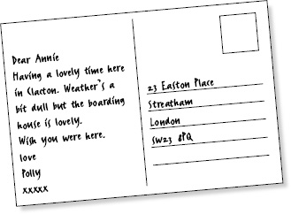
ILLUSTRATION 2 Typical postcard layout. Keep your message brief
When choosing a postcard, think about both the message you want to convey and the personality of the recipient. A comic illustration may be good for your college friend but singularly inappropriate for your aunt or one of your work colleagues. Plain postcards, these days, tend to be enclosed inside envelopes anyway, so, if you are considering one of these, you might just as well use A5 headed cards. Postcards with subdued works of art tend to be suitable for just about anybody. If you want to appear sophisticated, always choose this more general variety rather than the type that displays a saucy image of a seaside pier.
WRITING TOOLS
There is a very wide range of writing tools from which to choose. Ball-point, fountain pen or felt tip are all possible. You need to make a decision about which might be the appropriate one for your particular requirements (and which might suit your handwriting and your message).
The short history of pen technology (above) may help to shed some light on how they all emerged but will not necessarily help you to choose. Imagine what effect is created when the most beautifully written letter in Britain is covered with a series of ink smudges and strange, psychopathic blotches. All credibility will be destroyed. On top of which, no one will be able to read the contents and people will not take you seriously. Your letter will almost certainly end up in the bin.
FOUNTAIN PEN
Many traditionalists, and many aesthetes, still think of the fountain pen as the classic means with which to write a handwritten letter. It looks amazingly elegant; you can choose the colour of your ink and it allows for the full potential sensuality of writing. The most effective love letters tend to be written in fountain pen.

Most people use black or blue ink but any coloured ink will do. Pale blue is not too wacky but makes a personal statement and tends to look slightly more feminine than dark blue. Many literary men have preferred to use brown ink since it is, similarly, slightly more personal in appearance but not too brazen. Bear in mind, if choosing a pale colour, that it must still be legible on the page and that yellows tend to fade from view even before arriving at the recipient’s door. Also bear in mind that fountain pens can scratch the paper if you are not careful, and this is clearly not a good thing.
BIRO
Biros are a step down from fountain pens in sophistication but they have their own advantages. For one thing, they do not, generally, smudge. They may not require quite the concentration or hand control that fountain pens do and they are not as wet. A biro is certainly an appropriate tool with which to write a postcard or a casual memo or note to a colleague. It is also, of course, much easier to transport than a fountain pen, since it will not automatically require extra paraphernalia like cartridges and bottles and, on a practical note, is relatively unlikely to leak into your coat pocket.
Most biros tend to be filled with black or blue ink. Similar rules about colour apply as for the pen. Other colours might be fine if your recipient works in the world of art or fashion. Otherwise, they might find bright orange both illegible and a bit eccentric.
FELT TIP
Felt tip is really best saved for the clear marking of envelopes. Most felt-tip nibs are quite broad and difficult to wield and they tend to remind people of their primary school. But they are excellent for writing on difficult surfaces, like a Jiffy bag.
TYPEFACES
Typeface is the word for the style of print that you are using on the page. There are many different kinds of typeface and each might appeal to a different kind of customer. Generally speaking, the two most common typefaces for business communication are Arial and Times New Roman. Arial is a bold, round sort of typeface without excessive adornment. Times New Roman tends to look slightly more serious since it is thinner and longer and the letters have all their formal curlicues, base lines and the n, for example, has its back hook at the top of the first stroke. This cross-line finishing off the stroke of a letter is called a serif. Characters without cross-lines (as in an Arial typeface) are referred to as ‘sans-serif’, from the French, meaning ‘without a serif’.
EXERCISE
1 Compare these typefaces.
2 Decide which one you like the best and consider why.
3 Consider which you find easiest to read.
4 Compare each text extract, which is the opening paragraph of a novel by Dickens, with its designated typeface and decide whether the two could be said to match in style.
5 Think briefly about your friends and decide which typeface you might use to write to each of them.
HELVETICA
My father’s family name being Pirrip, and my Christian name Philip, my infant tongue could make of both names nothing longer or more explicit than Pip. So I called myself Pip, and came to be called Pip.
Charles Dickens, ‘Great Expectations’ (1860)
This is a piece of prose supposedly describing someone’s childhood nickname. The written style is simple and the typeface is sans-serif and quite childlike in appearance. There is quite an appropriate match between style and content.
IMPACT
It was the best of times, it was the worst of times, it was the age of wisdom, it was the age of foolishness, it was the epoch of belief, it was the epoch of incredulity, it was the season of Light, it was the season of Darkness, it was the spring of hope, it was the winter of despair. Charles Dickens, A Tale of Two Cities (1859)
This is quite an epic opening to a novel. It is a declaration of a whole state of being and written in a distinctly Victorian style. The typeface looks quite modern, which is at odds with the period style of the writing, and lacks authority. The typeface is therefore at variance with the text both in feel and in appearance.
BRITANNIC BOLD
In these times of ours, though concerning the exact year there is no need to be precise, a boat of dirty and disreputable appearance, with two figures in it, floated on the Thames, between Southwark Bridge which is of iron, and London Bridge which is of stone, as an autumn evening closing in.
Charles Dickens, ‘Our Mutual Friend’ (1865)
This is a perfectly straightforward piece of descriptive prose with a touch of mystery to it. The typeface has certain old-fashioned characteristics – most notably on the ‘g’ – and, although it captures a little of the air of mystery about the piece, it’s not really clear enough to sustain a narrative of any length.
GOUDY TEXT
In the year 1775, there stood upon the borders of Epping Forest, at a distance of about twelve Miles from London – measuring from the Standard in Cornhill, or rather from the spot on or near to which the Standard used to be in days of yore – a house of public entertainment called the Maypole; which fact was demonstrated to all such travellers as could neither read nor write (and at that time a vast number both of travellers and stay-at-homes were in this condition) by the emblem reared on the roadside over against the house.
Charles Dickens, ‘Barnaby Rudge’ (1841)
This is an opening which immediately conjures up a picture of ‘days of yore’. Apart from the fact that the typeface is quite difficult to read, its high decorative values make it look quite antique. It is not a bad match, but not a perfect one either.
DOLMEN
As no lady or gentleman, with any claims to polite breeding, can possibly sympathise with the Chuzzlewit Family without being first assured of the extreme antiquity of the race, it is a great satisfaction to know that it undoubtedly descended in a direct line from Adam and Eve; and was, in the very earliest times, closely connected with the agricultural interest.
Charles Dickens, ‘Martin Chuzzlewit’ (1843)
The sentence is, again, quite a portentous one but in a rather more modest way. The author is clearly suggesting that the Chuzzlewits consider themselves to be a very distinguished family and he is slightly ridiculing them for this. The typeface is, for one thing, rather difficult to read. There is nothing in the text to suggest that this is an appropriate typeface.
There are no right answers: it is a question of personal taste, tact and common sense.
IS A LETTER NECESSARY?
Once again, and before you finally start writing, spend another few moments considering whether your letter really needs to be written at all. If it is a thank-you note or an apology, would it be more appropriate to telephone and speak to the recipient in person? Is it an issue that has already been aired at such length in conversation that a letter would merely add insult to injury? If the letter involves a highly confidential or delicate business matter, is the idea of committing your message to paper really the best way to proceed? If the facts might imminently result in a law suit, would it be better to consult a solicitor before putting pen to paper? Think about tact, tone and confidentiality. This may seem like repetitive advice but, in the long run, it could save you a lot of time and trouble.
Конец ознакомительного фрагмента.
Текст предоставлен ООО «ЛитРес».
Прочитайте эту книгу целиком, купив полную легальную версию на ЛитРес.
Безопасно оплатить книгу можно банковской картой Visa, MasterCard, Maestro, со счета мобильного телефона, с платежного терминала, в салоне МТС или Связной, через PayPal, WebMoney, Яндекс.Деньги, QIWI Кошелек, бонусными картами или другим удобным Вам способом.
Вы ознакомились с фрагментом книги.
Для бесплатного чтения открыта только часть текста.
Приобретайте полный текст книги у нашего партнера:
Полная версия книги
Всего 10 форматов