Полная версия:
The Artist’s Watercolour Problem Solver

Copyright
Published by Collins,
An imprint of HarperCollinsPublishers
77-85 Fulham Palace Road
Hammersmith London W6 8JB
www.harpercollins.co.uk
First published in 2003 Great Britain by HarperCollinsPublishers Ltd
Collins is a registered trademark of HarperCollins Publishers Ltd
© The Artist magazine, 2003
Editor: Geraldine Christy
Designer: Penny Dawes
Indexer: Susan Bosanko
The text and illustrations in this book were previously published in The Artist magazine.
The Artist magazine asserts the moral right to be identified as the author of this work.
A catalogue record for this book is available from the British Library
All rights reserved under International and Pan-American Copyright Conventions. By payment of the required fees, you have been granted the nonexclusive, nontransferable right to access and read the text of this e-book on-screen. No part of this text may be reproduced, transmitted, downloaded, decompiled, reverse-engineered, or stored in or introduced into any information storage and retrieval system, in any form or by any means, whether electronic or mechanical, now known or hereafter invented, without the express written permission of HarperCollins e-books.
HarperCollinsPublishers has made every reasonable effort to ensure that any picture content and written content in this ebook has been included or removed in accordance with the contractual and technological constraints in operation at the time of publication.
Source ISBN: 9780007149483
Ebook Edition © OCTOBER 2014 ISBN: 9780008108489
Version: 2014-10-15
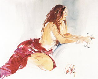
Vin Rouge, Paul Riley
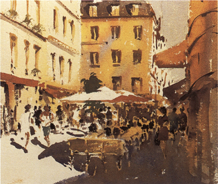
Parisian Side Street, Gerald Green
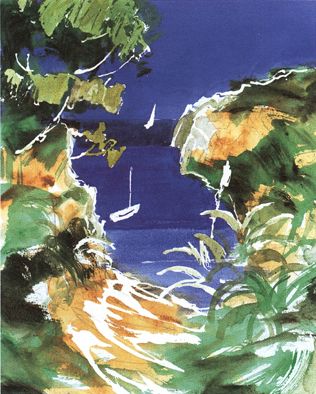
Portuguese Creek, Tom Robb
CONTENTS
Cover
Title Page
Copyright
Introduction by Sally Bulgin (Publishing Editor, The Artist)
1 A Matter of Subject John Lidzey 2 Fresh Start John Mitchell 3 Start to Finish Judi Whitton 4 Enhance your Colours Paul Riley 5 Tide Lines Ray Balkwill 6 Bright Ideas Julie Collins 7 Fruits of Experiment Anuk Naumann 8 Directional Pointers Gerald Green 9 The Blues Tom Robb 10 Go with the Flow Barry Herniman 11 Beyond the Limits John Lidzey 12 Brown Studies Tom Robb 13 Direct Approach Judi Whitton 14 Tone Control Hilary Jackson 15 The Freedom of Mixed Media Anuk Naumann 16 Citrus Hues Tom Robb 17 Painting Nudes Sally Fisher 18 Lost and Found Judi Whitton 19 Fabrics and Folds Paul Riley 20 Hundreds of Greens Julie Collins 21 Lighter Darks Barry Herniman 22 Crisp and Clear Gerald Green 23 Going for Gold Anuk Naumann 24 Time to Stop Judi WhittonArtists’ Biographies
About the Publisher
INTRODUCTION
Following the worldwide success and popularity of The Artist’s Problem Solver, first published in 2001 by HarperCollins from the long-running series in the UK’s The Artist magazine, we decided to collaborate on this second publication, concentrating this time on the most helpful watercolour problem-solving articles from the magazine series.
As I mention in my introduction to the first book, the aim of the ongoing series on which this most recent book is based is to tackle painting enthusiasts’ most common problems by posing their questions to top-class artist-tutors, who offer advice and possible solutions to each problem through down-to-earth instruction and demonstrations.
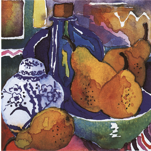
Pears in the Studio
(Anuk Naumann)
20.5 × 20.5 cm (8 × 8 in)
In this latest publication, the problems covered are those encountered specifically by watercolourists, although you may find that the ideas are relevant to painting subject matter in other media too. Watercolour is a wonderfully expressive medium, offering endless opportunities for portraying subjects, but it can be unpredictable and you may need guidance to overcome sticking points and reach your full potential. Here you will find a myriad of different watercolour problems which cover topics ranging from finding inspiration, using your chosen colours to their greatest effect and working up pictures from sketchbooks, to creating impact through tone control and recognizing the point at which to stop work on a painting. The subjects covered are also numerous and feature landscapes, seascapes, interiors and still-life paintings, as well as nudes, flowers and fabrics amongst others. There is something of value to every painter, whatever their level of skill.
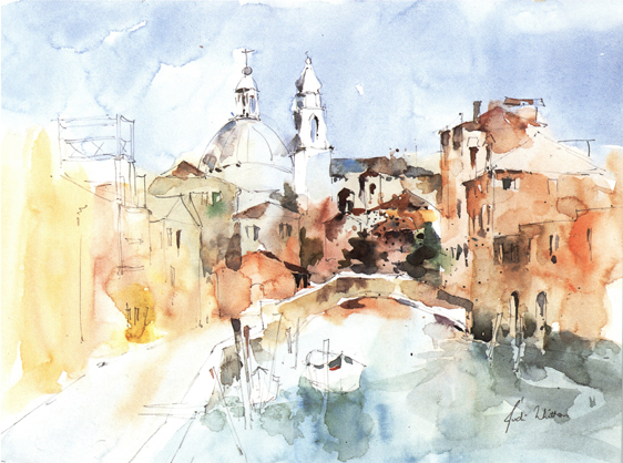
Venice (Judi Whitton)
25.5 × 33 cm (10 × 13 in)
Each of the questions posed has been tackled by well-known practising artist-tutors with empathy for students’ concerns and needs. These include John Lidzey, Paul Riley, Ray Balkwill, Tom Robb and Judi Whitton, who offer advice based on their own approach to the subject or problem in hand. The result is a cornucopia of information, advice and inspiration to encourage watercolour painters of all levels of experience.

Publishing Editor, The Artist
1
A MATTER OF SUBJECT
What shall I paint next? Can you suggest new subjects that will stimulate renewed inspiration?
Answered by:
John Lidzey
The problem of finding a subject to paint seems to affect many artists, while others appear to have no trouble at all. From my own early experience I know the frustration of wasting a morning in failing to find something worthwhile to paint. It might be seen, I suppose, as a condition that is similar to writer’s block.
LANDSCAPES
For those within reach of a park or the countryside a landscape is always a stimulating subject. But one problem that occurs with many landscapes, especially those painted in watercolour, is that the results can look unexciting. Quite a few that can be seen in local exhibitions are views painted at midday (or thereabouts) in mild sunny weather. In many cases the scenery lacks any real interest, often being just a panorama of trees and fields.

Houses by the Mere at Diss
15 × 47 cm (6 × 181/2 in)
Houses in trees can make a very good subject. A sketch like this can provide a satisfactory reference for a finished painting. When the weather became wet I completed the view from my car.
There are more interesting possibilities to be found in landscape subjects related to twenty-first-century agriculture. The technology of farming is changing. Heavy machinery of all sorts now does the work of many people. Although lacking the rustic charm of nineteenth-century farm equipment modern farming machinery offers challenging painting subjects.
For those who have no interest in the current farming scene, yet wish to produce interesting landscapes, there is always inspiration to be gained from making the weather a dominant feature. Working just from sketches made on the spot, it is possible to create paintings in the studio with an appearance of rain and wind. Some excellent techniques for depicting these effects are shown in Patricia Seligman’s book Weather – How to See It, How to Paint It (unfortunately out of print, though your local library may have a copy). You may also find Turner’s landscape work to be useful in this context. Try to see some of his watercolour paintings and sketches in Tate Britain at Millbank, London, or at least in reproduction in the many books on his art.
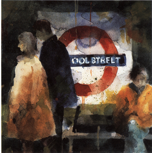
Liverpool Street Underground
18 × 17 cm (7 × 61/2 in)
Inspiration can even be found below ground. I kept this painting very loose, allowing the paint to run freely, dropping pure colour into wet washes; I further broke up the imagery by flicking colour onto the painting surface.
STREET SCENES
There is also great potential in urban scenes. A good way of working in cities is to make sketches and to take photographs. These can often make excellent references for finished paintings that can be produced in the studio or at home. Many years ago, when I lived in London, I spent many early mornings sketching in local streets from the comfort of my car, afterwards taking a photograph of the same subject to correct any infidelities of scale or perspective in my sketch.
While you are in the city with a camera see if you can use it in some of the less public spaces. Open-air cafés can make splendid subjects. Buses, trains and railway stations can be good to paint, too. Many cities have a river running through – look at the possibility of photographing and sketching from a bridge. Beautiful effects can be obtained with the sun reflecting off the surface of the water. Additionally, you could try using your camera at dusk in the city – you can capture some really magical urban scenes in the half-light. There can be a wonderful air of melancholy encapsulated in a lighted window with the curtains drawn just as dusk begins.
INTERIORS
Subjects taken from towns and cities can make expressive pictures. These are public and impersonal, but domestic settings can show intimate moments that are intriguing. I cannot pass the lighted window of a house without just the shortest peek inside. Interiors are like stage sets waiting for the play to begin and a painting of an interior can have the same theatrical quality. Kitchens, bedrooms, bathrooms, hallways and sitting rooms can offer interesting subjects.
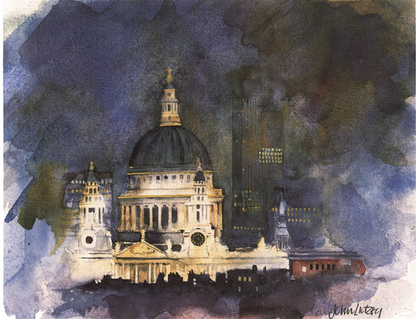
St Paul’s Cathedral at Night
35.5 × 40.5 cm (14 × 16 in)
Cities at night offer interesting subjects. It is best to work from a photograph rather than try to create anything on the spot. In this case I introduced silhouettes of houses in the foreground to reinforce the floodlit effect. Loose brushwork was used for the sky to give it interest.
If you have not tried painting an interior before do not be too ambitious at first. Begin with the simplest of subjects; perhaps a chair against a plain wall. Maybe an item of clothing could be draped over the back. A picture of some sort could be positioned on the wall behind the chair. A simple theme such as this can be very worthwhile. The light and shade from a nearby window can create interesting patterns on the wall. Such a subject can help develop your observational skills and your drawing ability. If you find the drawing a real problem you could take a photograph and work from that, but only use the photograph for drawing reference. When it comes to the painting stage rely on what you see in the subject, not what is in the photograph.
Windows painted from the inside looking out can make good subjects. A table placed close to the window with such articles as a plant, flowers, jug, vase or bowl of fruit could work very well. If the window has a sunny aspect this could be an added bonus. Remember, however, that patterns of light and shade change very quickly. The sunlight can be totally different within an hour or less. If you are quick enough you could make a quick pencil sketch that identifies the light and shade at a particular point in time. Alternatively, take a photograph!
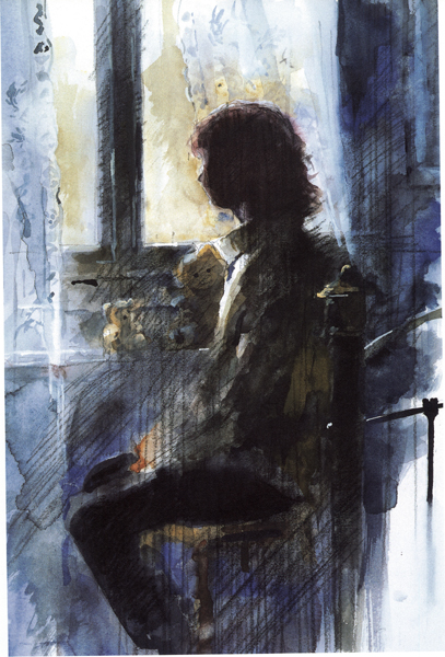
In a Bedroom
51 × 30 cm (20 × 13 in)
A figure sitting against a window makes an excellent subject. A semi-silhouette like this can be easier to work on than a figure illuminated from the front or side. Here I used limited colours: mainly Yellow Ochre, French Ultramarine and Indigo. For the highlights I used white gouache.
Doors and doorways always make fascinating subjects. A view through a half-open door can be an intriguing possibility. The viewer of the painting is left in suspense about the part of the room that cannot be seen. Experiment with this kind of subject. Position yourself in relation to a half-open door so that something interesting is in view, possibly a figure looking out of a window. If the view is into a bedroom maybe some discarded clothing might be seen or even just hinted at. Other possibilities might be an open cupboard door revealing the contents, an untidy chest of drawers with items spilling out, a table set for a meal or part of a dresser with chinaware. These are eminently paintable subjects, which in many cases are not too difficult to draw (with a little practice). The joy of such simple subjects is that they are readily available and unlike outside ones the state of the weather is not a consideration.
Bonnard and Vuillard devoted most of their lives to interiors, producing work that enthrals and fascinates the public and critics alike.
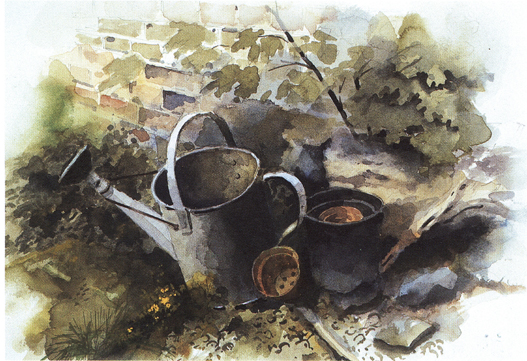
Gardener’s World
23 × 30.5 cm (9 × 12 in)
A few items in a garden corner can be all that are needed to make an interesting subject. I have positioned the watering can and a flower pot at odd angles to suggest an untidy effect. The weeds and stones contribute to a feeling of neglect that is slightly at odds with the title of the picture.
THE STILL LIFE
Still life has been popular with artists since the sixteenth century. Early examples of the form were laden with symbolism, chiefly to remind the spectator of the transience and uncertainty of life. Thus an arrangement might consist of butterflies, skulls, mirrors, candles, hourglasses and similar objects that hint at the temporal nature of human existence. Even now we are subject to an unpredictable course of events, so perhaps there is still room for such items gathered together to form the subject for a meaningful still life.
Antique shops are an obvious place to start looking for appropriate and interesting objects, although these are often expensive. Charity shops and car boot sales are alternative sources of unusual items, going cheap. It is surprising how battered, rusty items can make good subjects for a still life, especially if placed in conjunction with something delicate and fresh. Imagine, for example, a composition created from a broken framed mirror and a few flowers, especially with the right kind of lighting. An anglepoise lamp, its light directed from an oblique angle, could provide dramatic lighting for a really interesting painting laden with ‘symbolic’ meaning.
Allow yourself to be influenced by the late still lifes of Cézanne, whose simple arrangements of everyday objects were the basis of a series of inspirational paintings. A plate, a glass and some apples can be all that is needed. If you are uncertain about handling complicated subjects, a simple arrangement of no more than three or four pieces of fruit is all you need.
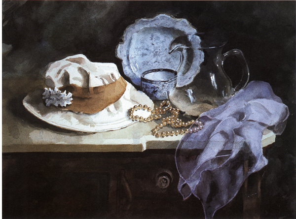
Still Life with Glass Jug
42 × 56 cm (161/2 × 22 in)
Just a few objects of varying colour, shape and texture can be stimulating to paint. I carefully drew and painted this set-up to provide a ‘realistic’ quality, but a much looser treatment can also make for an interesting painting. Keep your eyes open in antique shops for items that have particular qualities.
Think about a still life based on a particular theme – a kitchen-based subject, for example. Such simple items as a saucepan together with some vegetables imaginatively grouped together and suitably lit, could make a wonderful subject for a watercolour painting.
Kitchen equipment has lots of potential for still lifes. Choose from scales, mixers, sieves, bowls, knives, graters, whisks and similar items, plus the items of produce and foodstuffs that may be found in most kitchens. Broken crockery in the kitchen offers a marvellous subject for a still life. For example, a teapot, a sugar basin, a saucer, a broken cup and some spilt tea could make an intriguing painting.
MANY POSSIBILITIES
Think about your subject matter well in advance of starting work. Do not just stretch a sheet of paper and then wonder how to fill the space. Always be on the lookout for suitable subjects and keep notes about your ideas.
You might see a painting in a gallery that could spark off an idea of your own, or two objects in conjunction with one another. Good subjects do not just present themselves – they have to be thought about and created through observation.
2
FRESH START
I don’t like this painting – it’s so tired and lifeless. Can you help?
Answered by:
John Mitchell
The first thing to appreciate is that, at times, everyone has this problem. Let us look at how you can give yourself the best chance of producing fresh and exciting works.
Choice of subject matter is important. Go for something original, not secondhand. Go for something exciting, not dull. Go for something you know about, something that arouses your curiosity, that ‘turns you on’. Fine words, but how do you do it? The answer is to explore the world around you in your sketchbook.
I cannot emphasize the benefits of using a sketchbook enough. Forget about copying other people’s paintings or photographs. Forget about that lovely calendar, or the postcard from a friend. Find your own subject matter. Here is a list to think about: family and friends, gardens, parks and holiday resorts, harbours and docks, beaches and woods, plant and mechanical forms. You could use a favourite poem or an excerpt from a book, even a piece of music. Visit exhibitions and look at art books to find inspiration.
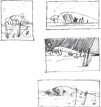
I developed thumbnail composition sketches from a previous pencil sketch.
PRE-PLAN YOUR PAINTING
Launching right into a painting from a sketch without doing some pre-planning is a mistake. You may find, too late, that one object should not be in, or needs moving – so out comes the sponge to remove it. Perhaps that colour looks wrong – it has to be changed. Perhaps that dark area needs to be lightened. No wonder the colour quickly becomes tired and the paint surface deteriorates.
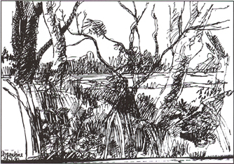
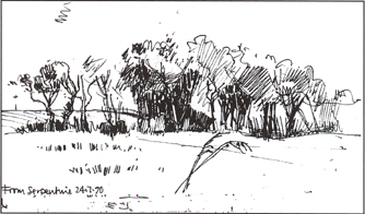
These two sketchbook studies were made in fine felt-tip pen in an A6 sketchbook. It is essential to collect source material in this way. As you finish each book, file it away safely. It will provide material for years to come.

