Полная версия:
The Artist’s Problem Solver

COPYRIGHT
Collins, an imprint of
HarperCollinsPublishers
1 London Bridge Street
London SE1 9GF
www.harpercollins.co.uk
First published in Great Britain by Collins 2001
Copyright © The Artist Magazine, 2001
Editor: Geraldine Christy
Designer: Penny Dawes
The Artist Magazine asserts the moral right to be identified as the author of this work.
COVER: Detail from Cherries in Porcelain Bowl, Anuk Naumann.
DETAILS (FROM THE TOP): San Rocco, Venice, Winston Oh; Flowers and Hat in Lamplight, John Lidzey.
The text and illustrations in this book were previously published in The Artist Magazine.
A catalogue record for this book is available from the British Library
All rights reserved under International and Pan-American Copyright Conventions. By payment of the required fees, you have been granted the nonexclusive, nontransferable right to access and read the text of this e-book on-screen. No part of this text may be reproduced, transmitted, downloaded, decompiled, reverse-engineered, or stored in or introduced into any information storage and retrieval system, in any form or by any means, whether electronic or mechanical, now known or hereafter invented, without the express written permission of HarperCollins e-books.
HarperCollinsPublishers has made every reasonable effort to ensure that any picture content and written content in this ebook has been included or removed in accordance with the contractual and technological constraints in operation at the time of publication.
Source ISBN 9780007165711
Ebook Edition © JANUARY 2015 ISBN: 9780008108472
Version: 2015-01-05
CONTENTS
Cover
Title Page
Copyright
Introduction by Sally Bulgin (Publishing Editor, The Artist)
1 Subject Spotlight Gerald Green 2 Centre of Interest Jackie Simmonds 3 Creating Depth John Mitchell 4 Seven-minute Skies Winston Oh 5 The Longer View Jackie Simmonds 6 Floral Still Lifes John Lidzey 7 Sense of Movement Peter Partington 8 Clues & Illusions Richard Pikesley 9 Tonal Strength John Mitchell 10 Soft Garden Colours Jackie Simmonds 11 Painting Skies John Lidzey 12 Figures in Paintings Gerald Green 13 Woodland Scenes Jackie Simmonds 14 Shapes & Rhythms Peter Partington 15 Unity in Still Lifes Anuk Naumann 16 Children at Play Jackie Simmonds 17 Illusion of Light Gerald Green 18 Life in Landscapes Winston Oh 19 Landscape Greens Tom Robb 20 Street Life Gerald Green 21 Broken Colour Jackie Simmonds 22 Control of Detail John Lidzey 23 Design & Movement Gerald Green 24 Rescue Strategies Hilary JacksonKeep Reading
About the Publisher
INTRODUCTION
The Artist’s Practical Problem Solver has proved to be one of the most popular, helpful and longest-running series in the UK’s The Artist magazine (first published in 1931). The aim of this ongoing series is to tackle students’ most common painting problems by posing their questions to a variety of top-class artist-tutors, who are invited to offer advice and possible solutions to each problem through down-to-earth instruction, demonstrations and practical ideas.
As the series began to unfold in each monthly issue of the magazine, following the appearance of the first article in the January 1999 issue, I was asked by a growing number of readers about the possibility of developing the Practical Problem Solver series into book form, as a valuable reference guide. Happily, HarperCollins also thought that this would be a good idea: hence the collaboration between The Artist magazine and the book publisher to produce this new, practical art book with answers to the most frequently asked questions from the series.
You will find a host of different problems tackled here, of special value to painters with an interest in traditional subject matter: the basics of deciding on a good subject for a painting; how to convey depth and movement effectively; ways of coping with greens, painting skies, dealing with foregrounds; how to produce convincing figures and introduce them successfully into paintings; tackling backgrounds in still-life compositions; plus many other aspects of painting.
Jackie Simmonds,
GARDEN SHADOWS, C’AN GAURI
pastel on board, 46 x 66 cm (18 × 26 in)
John Lidzey,
STUDIO WINDOW IN SUNLIGHT
watercolour, 43 × 28 cm (17 × 11 in)
Each problem has been carefully considered by well-known artist-tutors, including Gerald Green, John Lidzey, Peter Partington and Jackie Simmonds, who offer sound advice based on their own approach to the subject in hand. The result is a cornucopia of inspired ideas to help you overcome difficulties you may have encountered already during your painting life; maybe those that you are struggling with at the moment; or situations that you might very well face in the future. Whatever stage you are at I know that you will find the encouragement and advice you need here, helping you to progress, and enjoy your painting.

Publishing Editor, The Artist
1
SUBJECT SPOTLIGHT
How do I decide what makes a good subject for a painting?
Answered by: Gerald Green
Talk to any gallery and you will invariably find that subject matter has a major influence on the picture-buying public. But to the artist the relevance of a subject is that it is simply the vehicle through which to express yourself at the time.
To begin with, what you choose to paint will often be influenced by the work of other artists whose particular painting style you admire. Or there may be a tendency to search for idealized or picturesque images that fulfil the preconceived notion of what you think a subject ought to include.
There may also be a desire to paint personal favourites that possess an emotional attachment or contain an element of nostalgia. The painting process then becomes an exercise in producing a ‘nice’ picture. This approach should always be avoided since the solution to deciding what might make a good subject lies not so much in what you choose but more importantly in what will be your response to it and how you are able to interpret it.
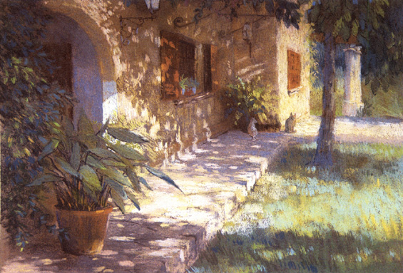
GARDEN, MALCESINE, ITALY
watercolour, 42 × 30 cm (107 × 75 in)
What caught my eye in this subject was the strong lighting. Strong tonal contrasts described the shapes of the elements in the picture. I made this sketchbook study using one warm colour, Burnt Sienna, and one cool colour, French Ultramarine. To maximize the impact of the light distribution I allowed the lightest areas to remain as white paper and then painted shapes rather than individual objects.
OBSERVATION
Recognizing potential subjects from your everyday environment or in seemingly ordinary or unlikely circumstances is an important part of artistic development. To do this you must first know how to look, in order to see with what is generally referred to as the ‘artist’s eye’. This means not merely looking, but observing nature in a particular way. Rather than looking at ‘things’ – flowers, still-life objects or elements in the landscape, for example – look particularly at the relationships between the various elements. Look for differing forms, shapes, lines formed between or linking different elements together, space, patterns and contrasts in tone, colour and textures. These more abstract qualities are the essentials of ‘seeing’ in artistic terms and should also be used as the criteria for selecting prospective subject matter. Images in which you can see a variety of these elements are likely to make the most worthwhile subjects for making a painting.
To understand this way of seeing more fully try looking at a view that you know well, first in the normal way, and then by observing the abstract qualities described. Notice the difference in your perception of what you are looking at. In practice this may be made easier by imagining everything to be on a flat plane, or try looking through one eye only to reduce the effect of distance. Even when not painting you can train your ‘artist’s eye’ by practising this way of seeing and soon it will become second nature.
SKETCHING
One reason why sketching is so important is that it exercises your ability in seeing. So explore your own visual environment, draw anything and everything, whatever happens to be in front of you. Do not just stick to your favourite subject matter.
Get into the habit of being a regular sketcher by always carrying a sketchbook and have it available for any convenient moment. There is an abundance of things around the home that can be used, from the general clutter inside the garden shed or garage to objects in the kitchen. Outside there are parks, gardens, parts of buildings or the clamour and hubbub of city streets; the choice is endless. The process of investigation through drawing will refine your visual awareness and awaken new directions for possible subject matter.
FINDING A FOCUS
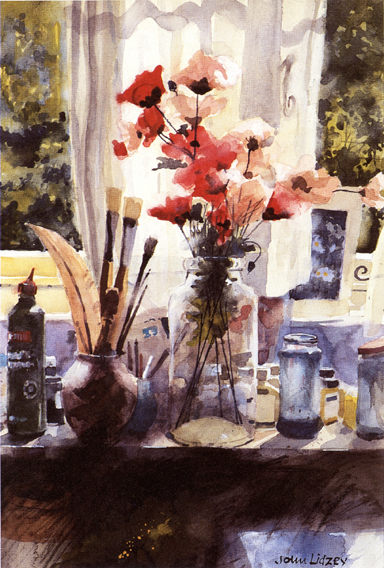
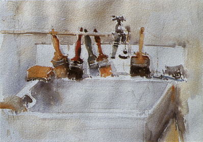
How you are able to interpret what you see is also fundamental to your quest to find suitable subject matter. Images that contain a balanced composition with a well-defined focus will give clarity to a painting. Subjects do not have to be bustling with activity or depict wide vistas of landscape. A couple of flower stems in a jam jar, or other simple everyday things like brushes on a sink, can make rewarding subjects. Yet they are often overlooked, or not seen in the right way.
SKETCHBOOK STUDY
watercolour, 28 × 38 cm (11 × 15 in)
When you begin to see with an ‘artist’s eye’ you will discover potential subjects in even the most mundane situations. This display is almost a permanent feature in the corner of my studio and, though I look at it every day, until I painted it I realized I had not actually ‘seen’ it before.
HALLWAY
watercolour, 53 × 38 cm (21 × 15 in)
Still-life images can be combinations of any objects. Ordinary everyday items, perhaps of little significance in themselves, combine to make an interesting subject.
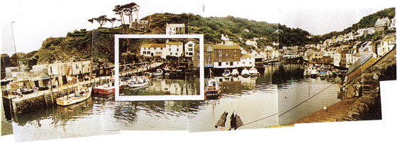
A viewfinder will help to isolate elements of a complex landscape view. The highlighted area is depicted in the drawing below.
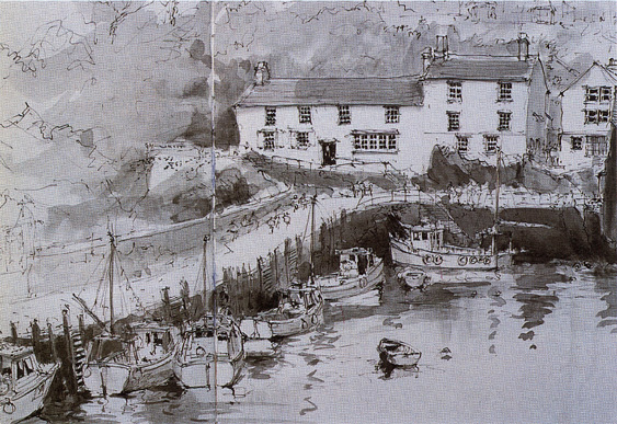
POLPERRO HARBOUR
pen and watercolour, 30 × 42 cm (75 × 107 in)
Drawing is a more rapid method of recording the essentials of a subject as the basis for a later studio painting. In this sketchbook drawing I included a monochrome watercolour wash to register the general tonal distribution.
Because our eyes take in an angle of vision of almost 180 degrees we have become accustomed to viewing the world on a wide screen. But painting requires you to focus on the particular, much like a spotlight in a theatre selecting one element of the performance at a time. For landscape work, looking through a viewfinder can be a useful aid. This can easily be made by cutting a 7.5 × 5 cm (3 × 2 in) hole in a piece of card which, when looked through at arm’s length, will enable you to see limited areas of the landscape in isolation.
This is useful for dissecting complex subjects, such as in Polperro Harbour. The photograph shows almost the full extent of the elevated field of view I had of a harbour setting. Though there were several subject opportunities here, I was attracted to the particular part of the scene, shown highlighted, by the tonal contrast between the white cottages set against the darker foreground elements, and the dominant angle of the harbour wall, which had the effect of leading the eye into the scene. I made the drawing to record the essential elements of the view. The addition of a monochrome wash also gave a record of the main tonal distribution.
Further opportunities for developing subject matter can be found by using on-the-spot drawings for later studio paintings, or by inventing subjects by combining parts from several drawings.
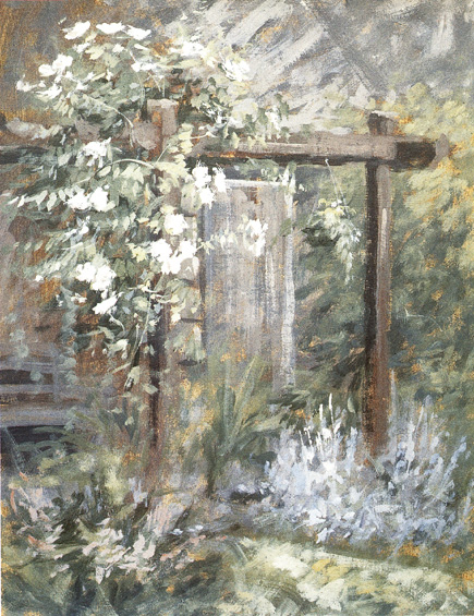
GARDEN CORNER
acrylic, 38 × 28 cm (15 × 11 in)
Many suitable subjects can be found in and around the home. This corner of my garden offered a ready-made composition with an amalgam of shapes, patterns and colours.
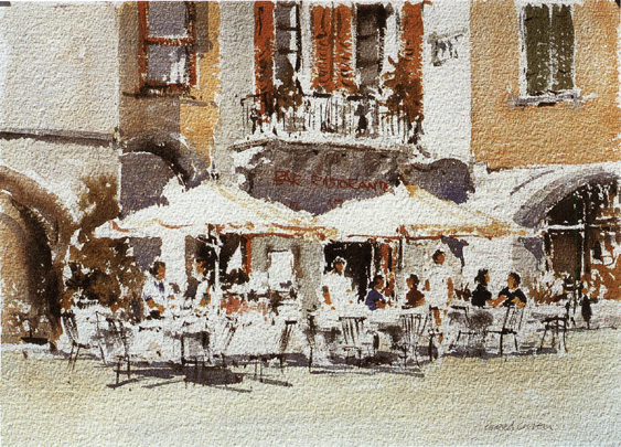
PAVEMENT CAFÉ
watercolour, 25 × 36 cm (10 × 14 in)
This subject focuses on a small corner within a busy area of pavement cafés. I wanted the painting to portray the essence of the subject as simply as I could without allowing it to become overworked with detail.
BRINGING SUBJECTS TO LIFE
Another major determinant in subject choice will be your ability and experience in using your chosen painting medium. If you are not adept at painting figures, for example, you will be far less likely to think of using them as possible subjects. But generally, whatever you choose, the best way to get the most from your subjects is to paint them in the most direct way you can. Aim for simplicity, both in your method of painting and means of expression. Do not try to create an exact copy, or produce a photographic likeness of your subjects.
Pavement Café illustrates a small corner of a large pedestrian piazza. I selected this area because the patterns of the shapes generated a lively composition, and my aim was to try to catch the essence of the subject with the minimum of detail.
Many of the problems that will confront you when painting can often be resolved by producing preliminary studies, either in monochrome or with limited colours, to help sort out doubts or uncertainties in the interpretation of your subjects. These can be small thumbnail sketches, or larger studies similar to Garden, Malcesine, Italy on page 8. This was produced using one warm and one cool colour to establish the distribution of tonal values, direction of lighting and colour temperature (the relative warm/cool colour relationships) within the proposed image.
Preliminary studies will also allow you to try out different colour combinations in which perhaps you wish to convey mood or atmosphere. In Winter Landscape the mood was achieved by using complementary colours, yellow and purple, which when mixed gave a range of neutral colours tending to grey in the middle. This gave an unusual colour cast to a wintry subject with the inclusion of a warm sky that, combined with using a middle range of tonal values (without the extremes of black and white) gave a more muted feeling to the painting in general.
Atmosphere is obtained principally by adjusting the quality of lighting in a painting. This can have the effect of reducing a subject to just a few simplified shapes. Paintings looking into the light, for example, will dramatically change the elements of a subject into a series of silhouettes.
So, wherever inspiration leads you, opportunities for subject matter exist all around you. All you have to do is to know how to look for them.
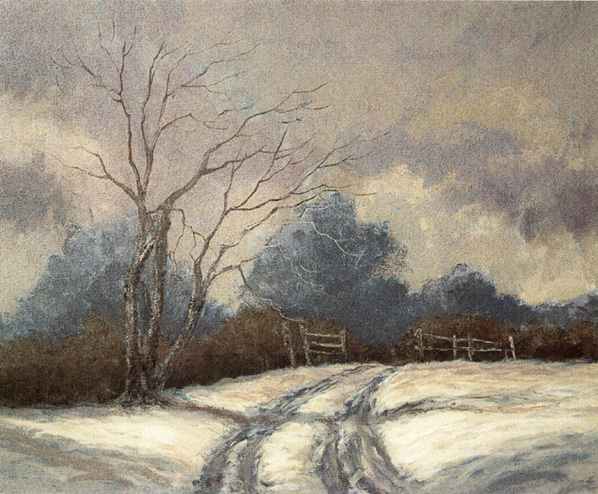
WINTER LANDSCAPE
acrylic, 51 × 61 cm (20 × 24 in)
Creating an atmosphere can transform seemingly uninteresting or commonplace landscape subjects. I based this studio painting on a small sketch that I made in the summer months. Closely related tones in combination with a restricted palette of yellow and purple gave a muted mood to the image.
2
CENTRE OF INTEREST
What is a focal point, and do I really need to worry about it unduly?
Answered by: Jackie Simmonds
Many wonderful pictures have been created by artists who have not bothered with a focal point; instead, these pictures tend to be about pattern and texture, a tapestry of shapes and colours. Nevertheless, I believe that a picture will always benefit from having one strong focal point – the centre of interest. A good way to think about a focal point is to create in your mind the picture of a stage full of dancers. The lights are set to wide beam, taking in the whole stage. Your eye darts from dancer to dancer, finding it difficult to concentrate on any one spot on the stage. Now imagine the lights dimming slightly, and a brilliant spotlight shooting out to illuminate one main dancer. Now you have no problem where to look: you are being directed to look in one spot, while your peripheral vision takes in the whole scene.
If you simply sit down to paint whatever is in front of you, without planning the composition, you run the risk of producing a weak picture, one without a sense of purpose. If the subject you select does not have an obvious focal point, you need to consider how to create one. A seascape, for instance, may have no obvious focal point – in fact, the sheer scale of an area of ocean makes it very difficult to focus on one spot – but for the picture to be interesting, the viewer’s eye needs to be held within the rectangle, focusing on one dominant area to begin with, before moving on to examine the rest of the image.
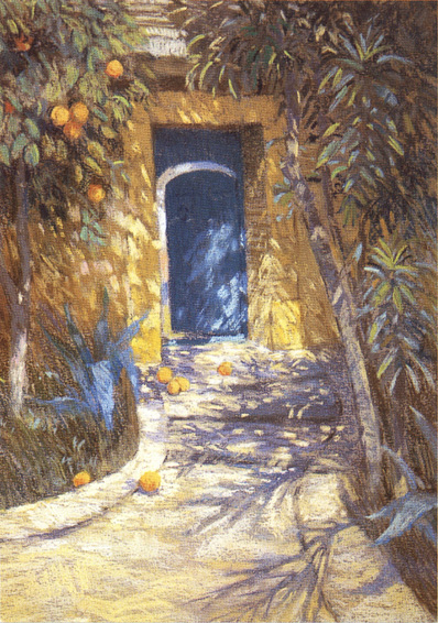
THE MOROCCAN DOORWAY
pastel on paper, 51 × 30 cm (20 × 12 in)
Here the viewer’s eye is directed to the doorway by the lines of the pathway. A little obvious, perhaps, but it works well! The doorway is positioned off-centre, and on the top right ‘eye’ of the rectangle. Notice, too, that the edges of the pathway, where they meet the edges of the rectangle, are asymmetrically placed. Positioning them at exactly the same point, to the left and to the right, would have been rather boring.
HOW TO SELECT A FOCAL POINT
Ask yourself when you sit down to paint what it was that first attracted you to the scene. It may help to write this down in your sketchbook. If you cannot answer this question immediately – it is possible that you just liked the whole view – ask yourself what you would best like to emphasize, or draw particular attention to. Sorting out your thoughts before you commit to paper is an important part of the process of painting. It does not mean that these ideas and thoughts are set in stone; you might decide to change the emphasis during the process of painting – but it certainly will help your confidence, and sense of direction, to have a good, positive starting point. Deciding on what is most important in your picture will give the picture meaning; your reason for choosing that particular scene will be clear to the viewer.