Полная версия:
Collins 30-Minute Painting

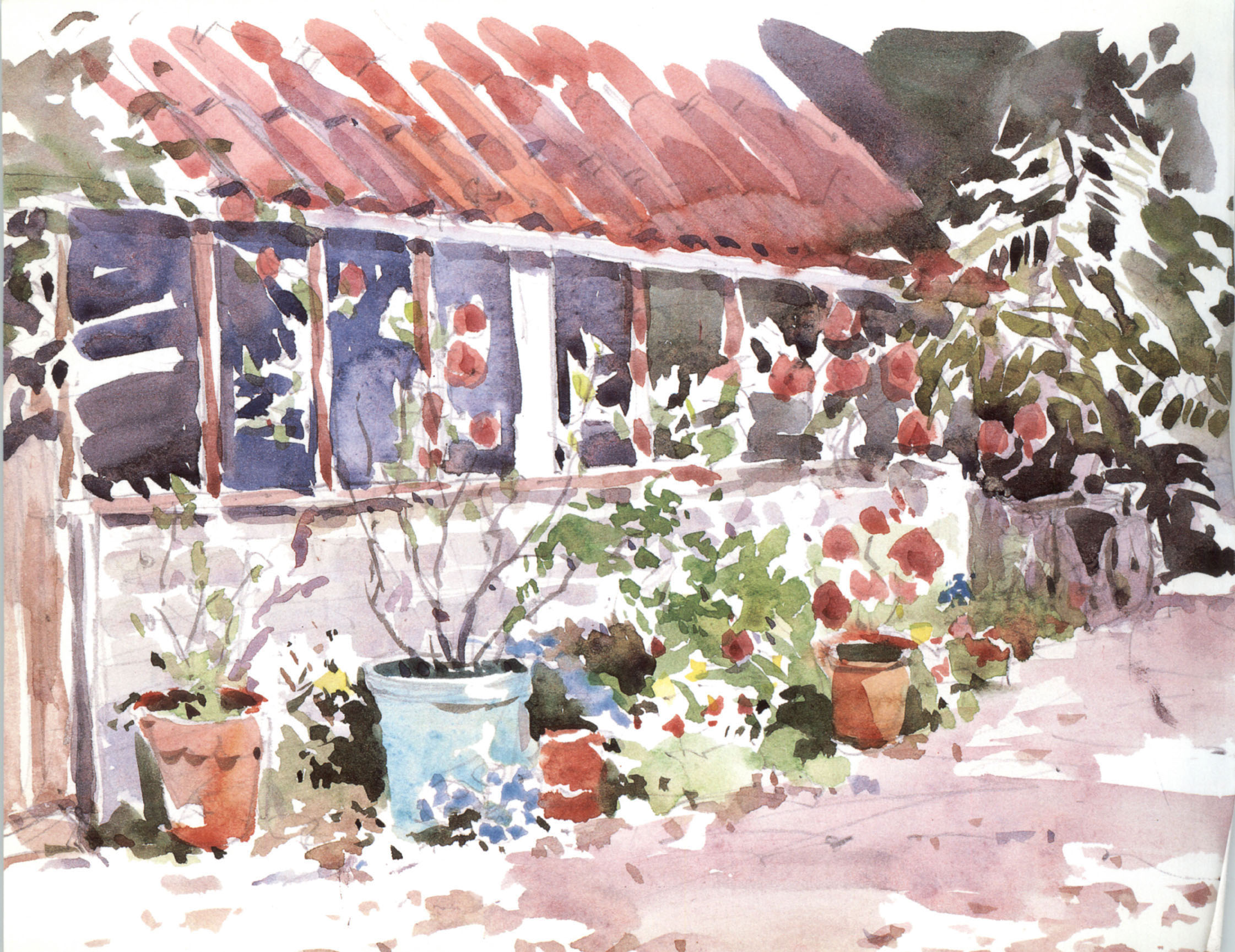
▲ From My Studio, 21 x 28 cm (8/½ x 11 in)
Sketching
Alwyn Crawshaw
Copyright
First published in 2008 by
Collins, an imprint of
HarperCollinsPublishers
1 London Bridge Street
London SE1 9GF
www.harpercollins.co.uk
Collins is a registered trademark of HarperCollins Publishers Limited.
© Alwyn Crawshaw 2008
A catalogue record for this book is available from the British Library.
Editor: Diana Vowles
Designer: Kathryn Gammon
Alwyn Crawshaw asserts the moral right to be identified as the author of this work.
All rights reserved under International and Pan-American Copyright Conventions. By payment of the required fees, you have been granted the nonexclusive, non-transferable right to access and read the text of this e-book on screen. No part of this text may be reproduced, transmitted, downloaded, decompiled, reverse engineered, or stored in or introduced into any information storage retrieval system, in any form or by any means, whether electronic or mechanical, now known or hereinafter invented, without the express written permission of HarperCollins e-books.
Source ISBN 9780007259380
Ebook Edition © OCTOBER 2018 ISBN: 9780008325794
Version: 2018-12-05
HarperCollinsPublishers has made every reasonable effort to ensure that any picture content and written content in this ebook has been included or removed in accordance with the contractual and technological constraints in operation at the time of publication.
Dedication
I would like to dedicate this book to June, my wife, for her continual support with all my artistic endeavours.
Contents
Cover
Title Page
Copyright
Dedication
Introduction
Essential equipment
Pencil techniques
Watercolour techniques
Sketching indoors
Simplifying your subject
Sketching outdoors
Holiday sketching
Using holiday photos
Further information
Acknowledgements
About the Author
About the Publisher
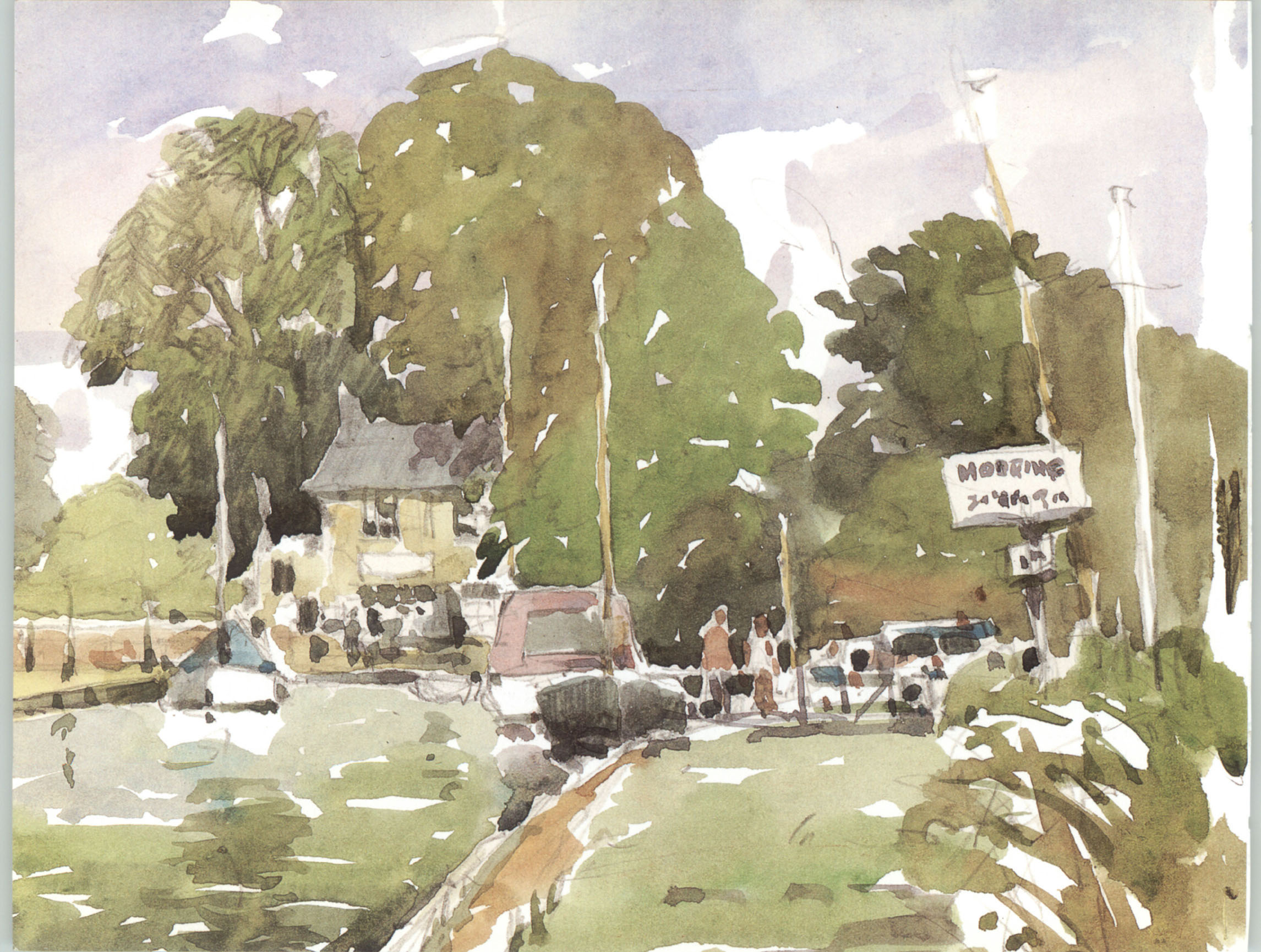
▲ Thurne Dyke
(detail, actual size in the print edition only.)
The most important part of this location sketch was the drawing, as it is a complicated scene with lots of activity.
Sketching is the most uplifting and enjoyable way to paint and it is a great teacher, whether you are working with pencil or paint, outdoors or indoors. There is no pressure on you, as you are not painting for an exhibition or to please your friends or family; you are sketching for your own enjoyment. Nevertheless, you can go on to show your sketches in exhibitions.
Because of the relaxed way in which they are done, sketches can often have more energy and dynamism than a highly finished work, and indeed some of the Old Masters’ sketches are actually preferred to their exhibition paintings.
What is a sketch?
There are three different types of sketches: an information sketch, done solely to collect information or detail; an atmosphere sketch, where the aim is to record the atmosphere and mood for a finished painting; and an enjoyment sketch, done usually on location simply to enjoy the experience. It is the enjoyment sketch that I will concentrate on in this book – the information and atmosphere sketches will develop as you gain experience.
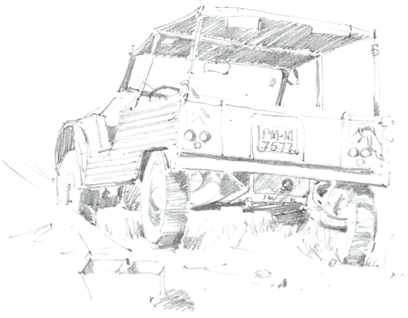
▲ Spanish Truck
This information sketch was done with a 2B pencil so that I could quickly put in shading to make the truck look three-dimensional and also add some detail.
30-minute sketches
Why a limit of 30 minutes? First, it will stop you fiddling and looking for something extra to do in your sketch, which can lose the spontaneity of it – a good sketch can be spoilt by overworking. Secondly, it will teach you how to observe your subject.
Many of the sketches I have done in the book have taken about 30 minutes, though some have taken a little less. Practise the techniques I describe for as long as you need and use the clock only when you have the confidence to start sketching. It is very important to take your time and carefully observe your subject, deciding how you are going to draw or paint it, before you start the sketch or, of course, the clock.
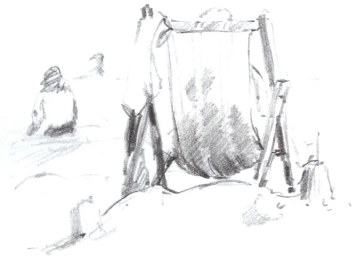
▲ Beach Deckchair
I used a 2B pencil to make a quick sketch of a deckchair on a beach while I was on holiday. It was done purely for enjoyment.
The aim of this book
In this book I will take you by the hand and show you how to enjoy your sketching without too much historical and technical information to complicate things. When you were at primary school you would draw or paint without any thoughts of whether it was good or bad – you had no inhibitions, you did it just for your own enjoyment. This is how I want you to approach sketching.
Remember that the 30-minute time limit is a guide only. We all have our own natural speed of working, but in all my 50 years of painting and teaching I have found working to a limited time one of the most inspiring and exciting exercises to do and some of my students’ best work has been done this way. So have a go – I know the 30-minute clock will help you.
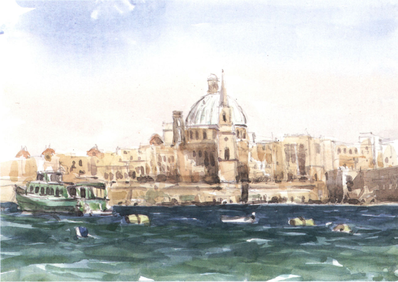
▲ Valletta, Malta
20 x 28 cm (8 x 11 in)
This watercolour enjoyment sketch may look more time-consuming, but notice how the distant buildings are done very freely.

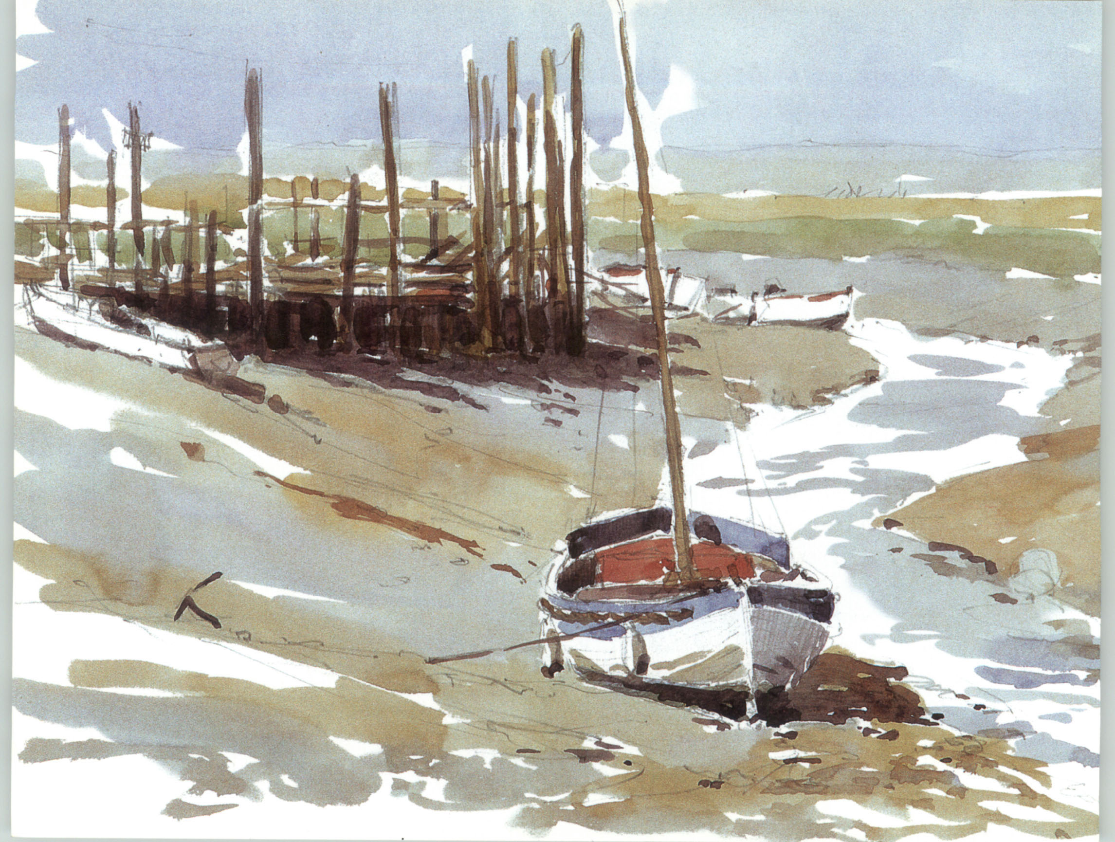
▲ Morston Quay, Norfolk
20 x 28 cm (8 x 11 in)
I painted this on location, using the minimum equipment needed for sketching outdoors.
For a beginner, going into an art materials shop must be very confusing. There are hundreds of brushes, many different papers and a bewildering choice of sketchbooks, pencils and paints, all invitingly displayed.
However, help is here: on the next two pages I will show you the basic simple materials you should buy. You don’t need a large range of equipment for sketching, and for working on location you certainly won’t want to carry a lot with you. Keep things simple with your materials at first and get used to them – if you want to try different ones, experience will guide you as you progress.
Pencils
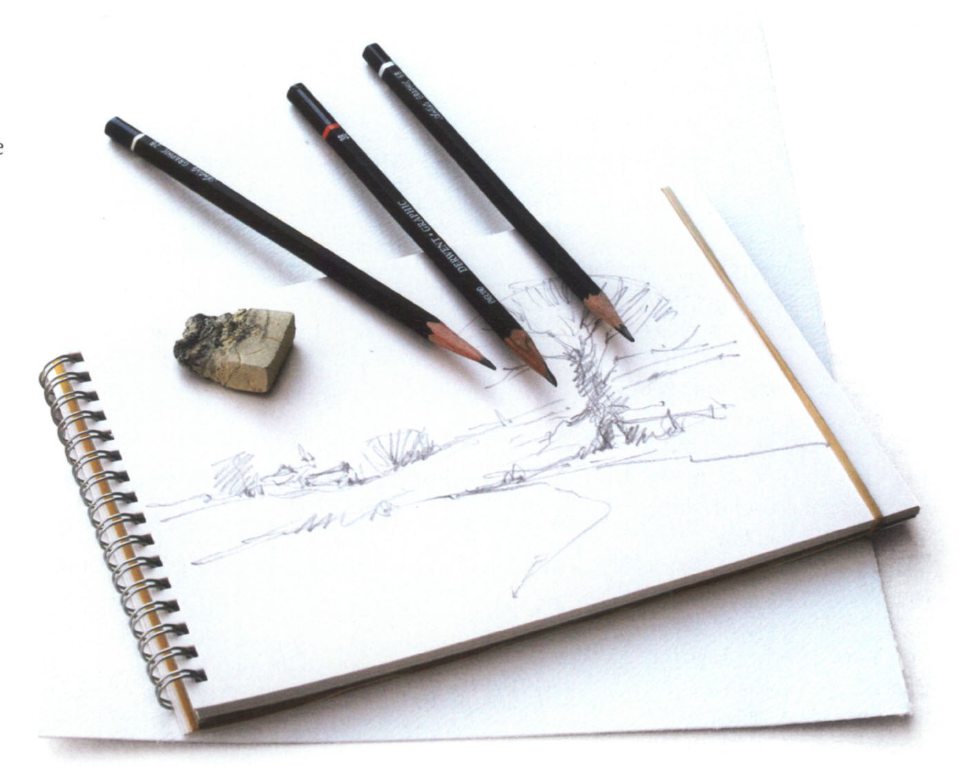
▲ A basic pencil sketching kit: 2B, 3B and 6B pencils, a putty eraser and sketchpads.
Pencils are available in a range of grades. The most familiar one, which you will find in any stationery shop, is HB. The letter ‘H’ stands for hard lead, and the range covers 2H, 3H, 4H, 5H and 6H. The hardest pencil is the 6H. On the other side of HB are the ‘B’ (soft lead) grades – 2B, 3B, 4B, 5B, 6B. The softest pencil is the 6B.
I use a 2B pencil for most of my sketching, but there are occasions when I turn to a 3B or a 6B. These are the three pencils you need for the exercises in this book. You will also require a putty eraser for rubbing out your pencil marks. It is impossible to get everything correct the first time, so an eraser is as important to you as your pencil.
Paper
Unless otherwise specified, all the sketches in this book are on cartridge drawing paper; the remainder are on Bockingford Not watercolour paper. Both can be bought in pads. There are a number of other watercolour papers available, in different weights and surfaces. When I am working outdoors, most of my sketching is done in a Daler-Rowney A4 or A3 cartridge sketchbook.
QUICK TIP
To stop your sketchpad pages flapping when you are working outdoors, just slip an elastic band round the outer edge of the pad.
Watercolours
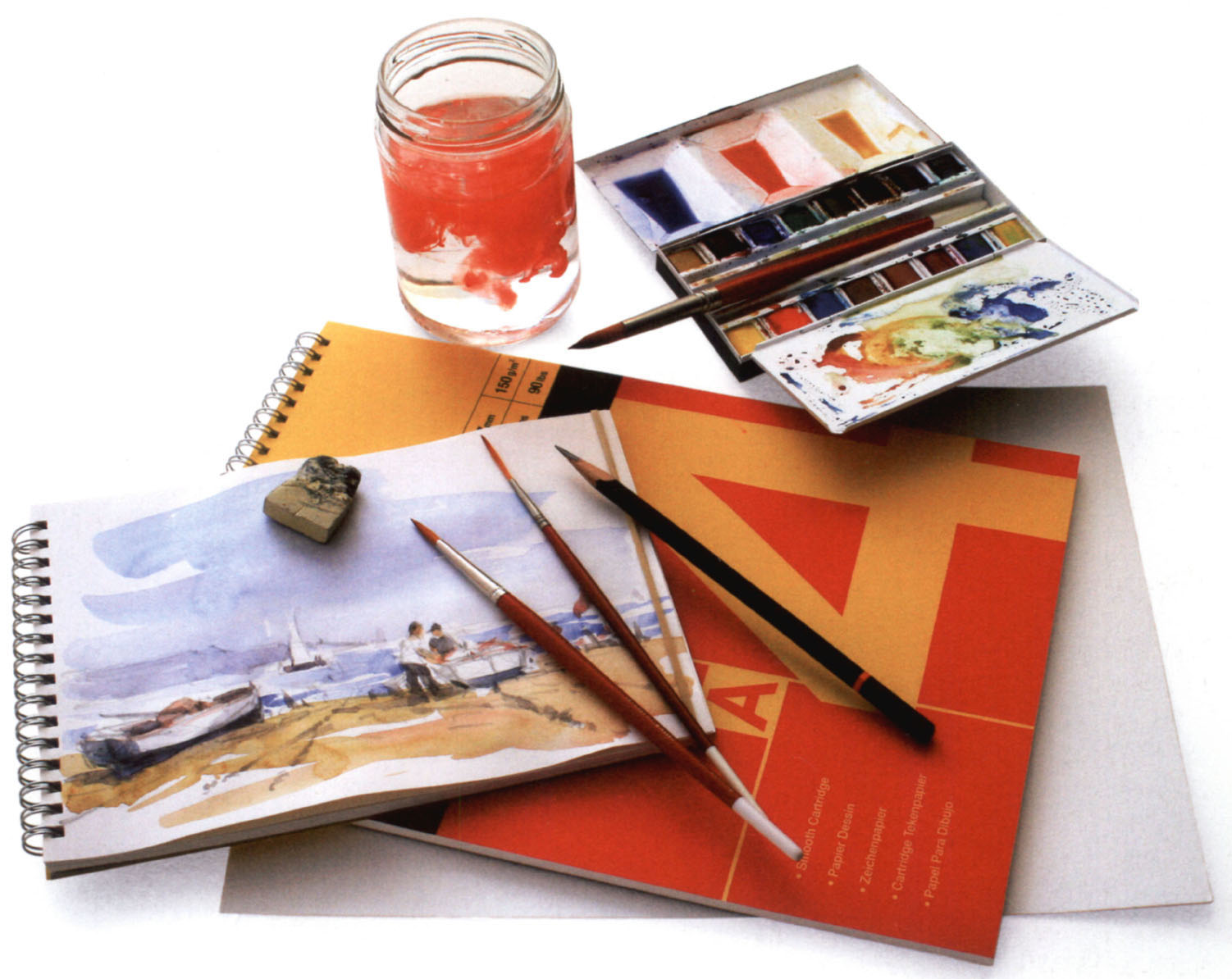
▲ A basic watercolour sketching kit: a water jar, a paintbox, three brushes, a 2B pencil, a putty eraser and sketchpads.
Watercolours come in pans or tubes. I recommend that you don’t use tubes, as you can control the amount of paint you put on your brush much more easily from a pan, and a paintbox of pans is much more convenient for sketching outdoors. There are two qualities of paint: students’ and artists’. I use artists’ quality, but Daler-Rowney Students’ Aquafine are very good and less expensive. The seven colours I use are discussed here.
Brushes
The best watercolour brushes are manufactured from sable hair, and they are the most expensive that you can buy. However, there are excellent synthetic brushes on the market that cost much less than sable, and they are used by many professional artists (Daler-Rowney Dalon is one example). I use a No. 10 round brush as my big brush, a No. 6 round as my small brush and a Daler-Rowney Dalon D99 Rigger No. 2 for thin lines. The higher the number, the larger the brush.

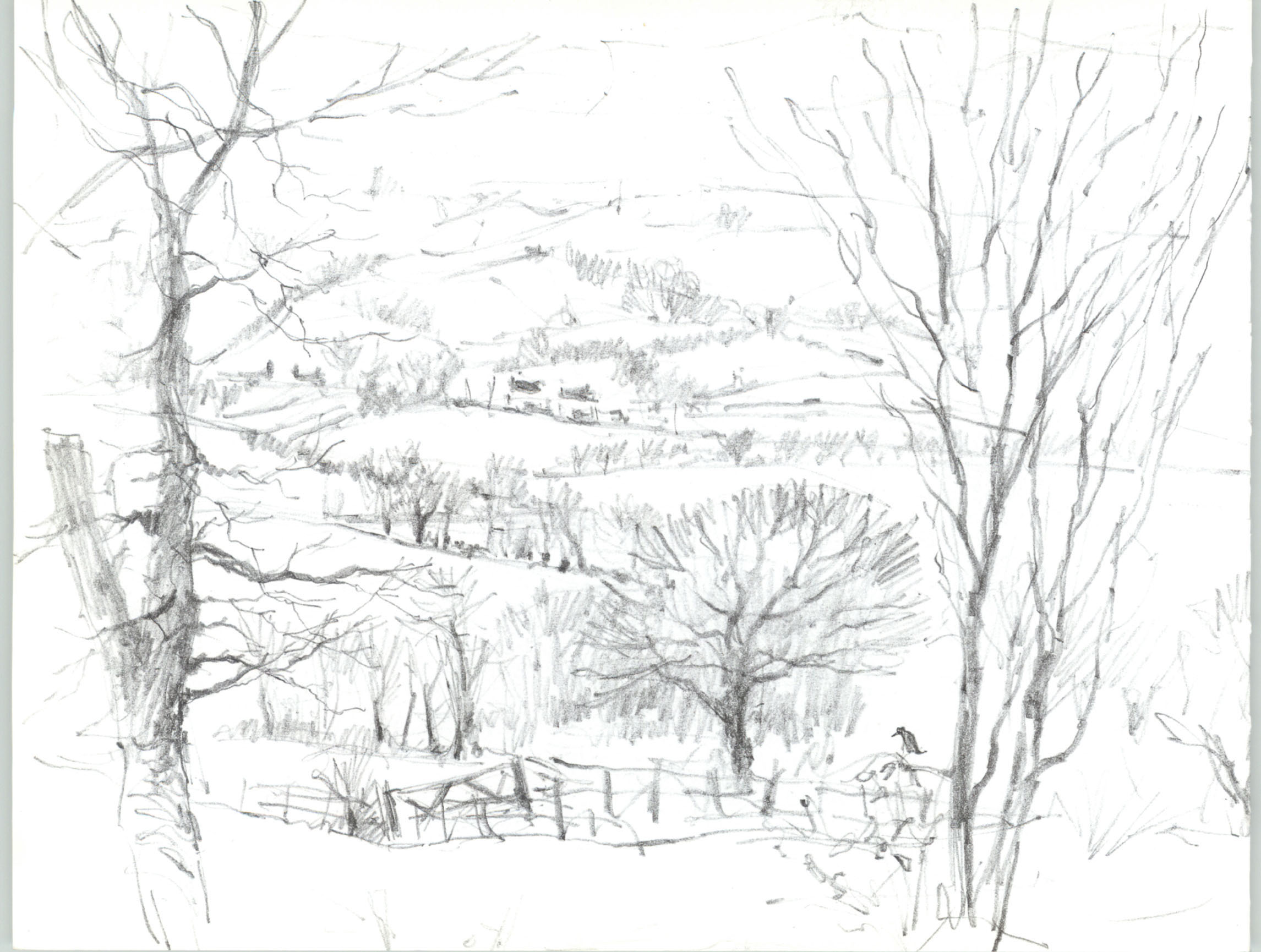
▲ From Donna and Andrew’s Garden
20 x 28 cm (8 x 11 in)
For this sketch I used a 2B pencil, which allowed me to draw thin branches on the trees.
The most versatile and convenient sketching tool is the pencil, and it is ideal for making quick 30-minute sketches. Pencil sketching has been done for centuries by world-famous artists; John Constable, England’s most renowned landscape artist, took sketchbooks as small as 5 x 10 cm (2½ x 4 in) on his travels.
The best thing about pencil sketching is that if you haven’t got any equipment with you, it is always possible to get a pencil and some paper to work on no matter where you are. I have sketched on the back of envelopes and even a long till receipt! In this chapter I will show you how to get the most out of your pencils.
Using pencils
To get the most variety of line and shading from a pencil when you are sketching there are a few simple things to learn, the most important of which is how to hold your pencil. With the three methods of holding it shown below, your pencil will do whatever you want on your sketch. However, your pencil must be sharpened with a sharp knife to give you a long point, not with a pencil sharpener.
Following the simple exercises shown here will help you to use your pencil effectively. As you do them, practise varying the pressure you put on the pencil to give stronger or lighter lines.
You can also use your eraser as a drawing tool, creating lighter areas in your pencil shading.
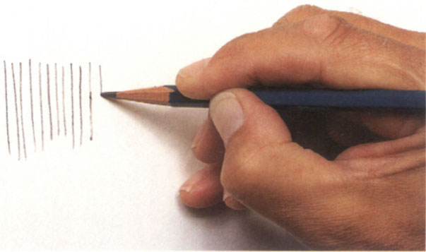
▲ The short hold position that you use when writing gives you most control.
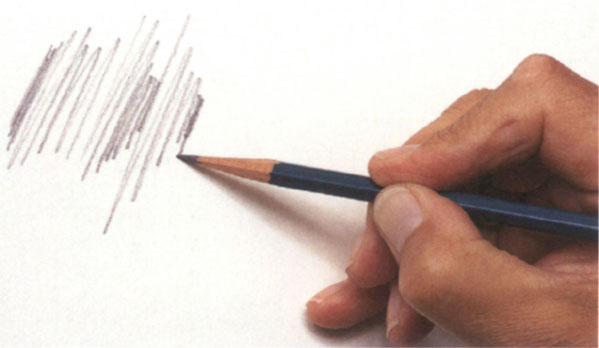
▲ The long hold drawing position allows more freedom over a large area.
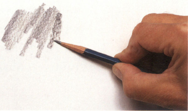
▲ The flat hold position allows you to work large shaded areas with fast, free, broad strokes by using the long edge of the lead.

▲ These exercises show definite strokes, made with a 2B pencil. When you can control these, practise more irregular strokes such as the ones in the sketch opposite. Scribble away and enjoy what a pencil can do.
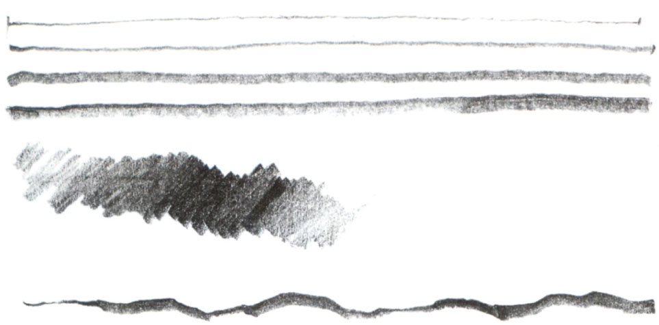
▲ These lines and shading were done with a 6B pencil. Compare the effect with the exercises done with a 2B pencil opposite.
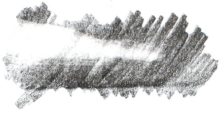
▲ A plastic eraser can be used to rub out a thick line from shading made with any pencil. An eraser can be as important when sketching as a pencil.
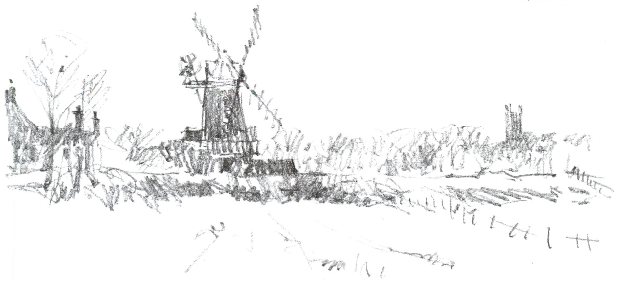
▲ I made this sketch of a windmill with my 6B pencil, which allowed me to work quickly when shading areas but was not suitable for putting in any detail.
PROJECT
Comparing pencil grades
The pencil grade you decide to use when you are sketching will depend upon how much detail you want to include in your picture and the overall effect you want to achieve.
Choosing the right pencil
When you are out sketching, time could be against you for all sorts of reasons: the weather, the journey, or perhaps you just want to sketch as many scenes as possible. Therefore speed is essential. The answer on these occasions is to use a 6B pencil. This is also a great way to help you learn to simplify your subject (see here). You can’t draw in fine detail easily, so you work for a quick overall visual image, not looking for detail. Above all, using this pencil will teach you not to fiddle!
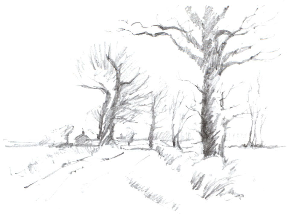
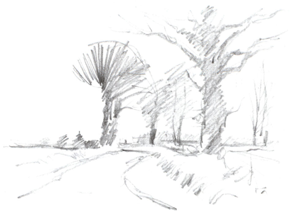
I did these three A4 sketches of a Norfolk lane to show the difference between a 2B, a 3B and a 6B pencil. For the first one I used my 2B pencil and it took 20 minutes plus experience! The second, using a 3B pencil, has less detail, because the pencil is softer and can cover areas more easily. The last sketch is done with a 6B pencil, and the difference is clear. Because the 6B has a very soft lead it is not easy to draw detail, but it is very easy to shade in areas quickly to give a simplified image. This sketch took minutes to do.
In this first project, sketch with your 2B pencil, then do the same sketch again with your 3B and 6B. Copy any of mine in the book, and try some of your own. I know you will enjoy it. Don’t work them smaller than A4 size, and don’t worry about time for the moment – working quickly will come.
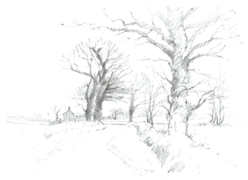
▲ 2B pencil
For this sketch I used a 2B pencil, which allowed me to draw some detail in the trees.
▲ 3B pencil
Here I used a 3B pencil. Because the lead is softer it’s a quicker but less detailed way of sketching.
▲ 6B pencil
Using a 6B pencil, I could block in areas in minutes but it wasn’t possible to show any detail.

▲ Steamroller
This was drawn on A3 paper with a 6B pencil. There is no fine detail in the steamroller, but its bulk and strength are very evident.

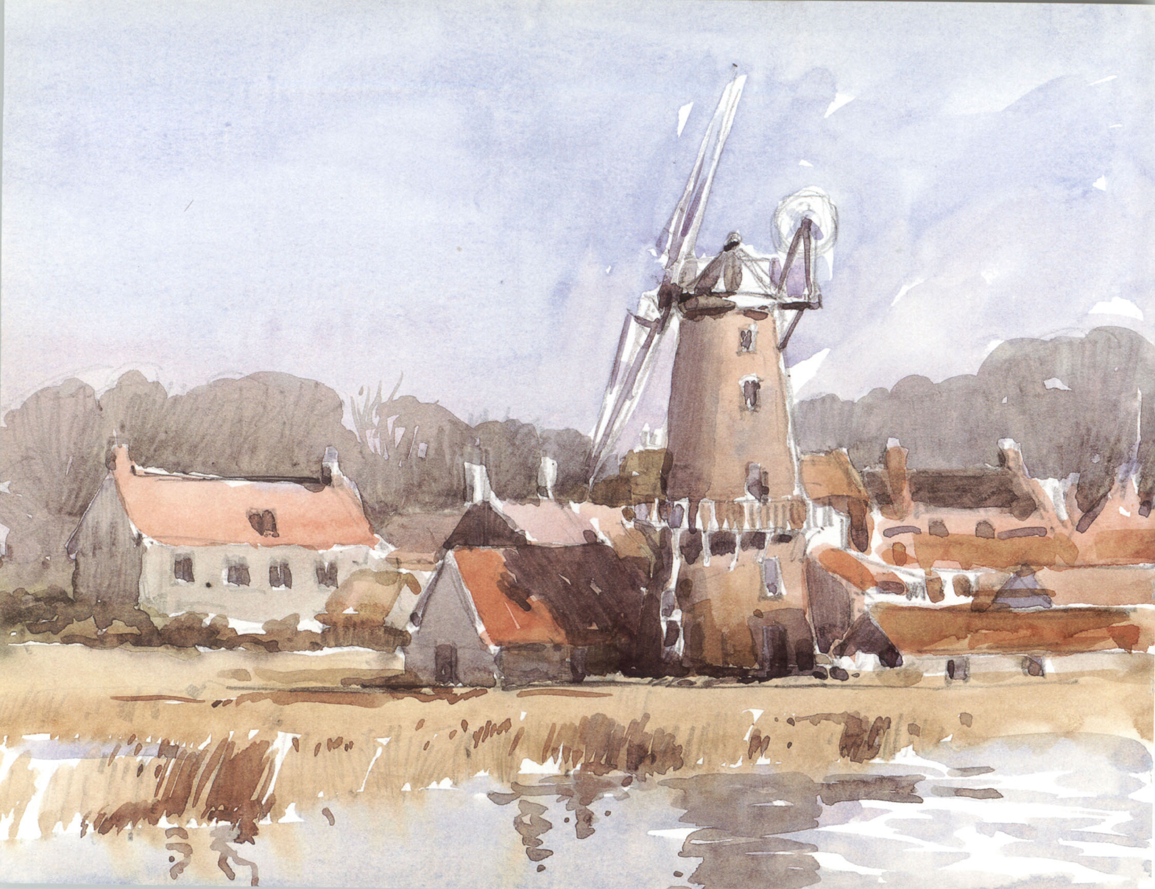
▲ Cley Mill, Norfolk
20 x 28 cm (8 x 11 in)
This sky was painted with a rough wash and brush strokes gave the water light and movement.
Over a period of time artists evolve some of their own techniques through experience, and this is fine – but there are some basic ones that you will need to practise and become familiar with before you find your own developing.
Watercolour is a very direct medium. Sometimes the quicker you work – with confidence – the better the result. So practise the techniques shown in this chapter and enjoy your watercolour sketching. Remember, time is not the most important aspect of practising. Work at your own speed to gain experience with the techniques, and speed will follow quickly.
Colour mixing
Mixing your colours is much easier than you might think. By using just three colours, red, yellow and blue, almost all colours can be created. These three colours are called the primary colours. There are, of course, different reds, yellows and blues, which can help in mixing, but I use mainly French Ultramarine, Alizarin Crimson and Yellow Ochre for 80 per cent of my paintings. The other colours I like to work with are Cadmium Red, Cadmium Yellow Pale, Coeruleum and Hooker’s Green Dark, and these seven are the only colours that I used throughout the book.
Achieving the right mix
In the colour chart shown here, the three primary colours are in the middle. If you mix red and yellow you make orange and as you add more water to the mix the colour becomes paler. This applies to all colours you mix. Naturally, if you mix more red than yellow your orange will be a reddish-orange, and if there is a greater proportion of yellow you will create a yellowy-orange.
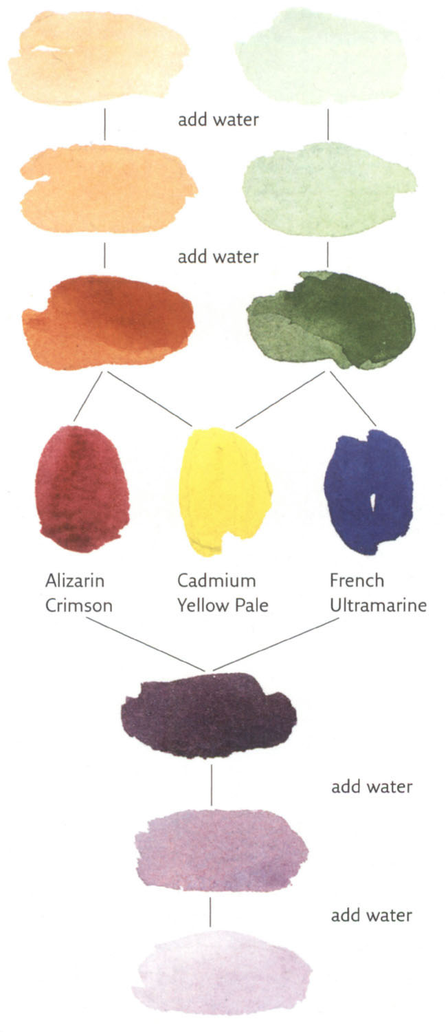
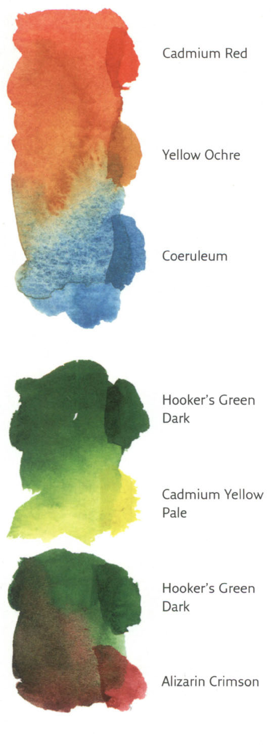
▲ Colour mixes
Practise mixing colours, using the ones shown here as a starting point.
Therefore, the most important rule when you are mixing colours is to put the predominant colour that you are trying to create into the palette first (with water). For example, if you wanted a bright yellowy green, you would put yellow into the palette first, then add small amounts of blue until you had mixed the green that you wanted. In this book, the first colour I specify is usually the predominant colour of the mix, with other colours added in smaller amounts.
It isn’t necessary to get the colour perfect. Practise mixing colours indoors, finding the colour of a cushion, an armchair, a piece of wallpaper, and so forth. Use any paper, even copier paper or the back of some old wallpaper – you’re not painting a masterpiece, you are mixing colours and practising for a masterpiece!
▲ Sunflowers
11 x 18 cm (4½ x 7 in)
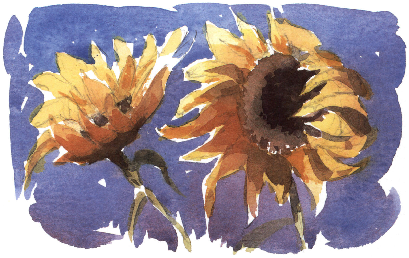
Here I used Cadmium Yellow, Alizarin Crimson and French Ultramarine on Bockingford Not paper, beginning with the yellow petals. The dark centres were painted using all three primary colours with little water. I left white unpainted paper showing in some areas, which gives extra life to a watercolour.
QUICK TIP
Use plenty of water when mixing your pigments to keep colours transparent. Too little water can make them look muddy.
Watercolour washes
The term ‘wash’ simply means an area of paint applied to a watercolour painting – it can be as small as a 2.5 cm (1 in) square or the size of your painting. In its most perfect form, it is an area of colour that is equal in tone throughout with no blemishes.
The secret of producing a good flat wash is to use plenty of water and not to allow the wash to dry as you work it. Start at the top on dry paper and take a large brush, fully loaded, from left to right. Start on the left again, picking up the reservoir of paint left by the first stroke, work to the right and continue in this way to the bottom. The paper must be tilted slightly to allow the paint to run slowly down. You can add in different colours as you go. For a graduated wash, make the colour paler by adding water to the paint in your palette as you work down.
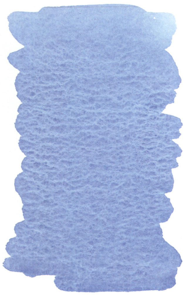
▲ Learning to paint a perfect flat wash is just a matter of following the basic principles and practising until it comes easily.
▲ Evening Sky
10 x 18 cm (4 x 7 in)
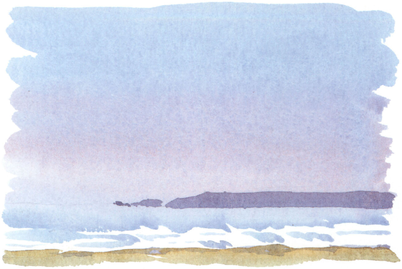
On Bockingford Not paper, I started the sky with French Ultramarine, adding Alizarin Crimson towards the horizon. The sea was French Ultramarine, and the headland was painted once that was dry.
Rough washes
Most of the time you don’t need to achieve a pristine wash – in fact a wash with blemishes and tone and colour changes gives life and movement to a sketch. From a practical point of view, having to work quickly outdoors does not allow for carefully laying a perfect wash and you will sometimes have to paint on top of a wash before it is perfectly dry, which will disturb any perfection you have managed to achieve. But remember, however you paint your sketches you must use plenty of water to keep your paintings fluid and simple.
Конец ознакомительного фрагмента.


